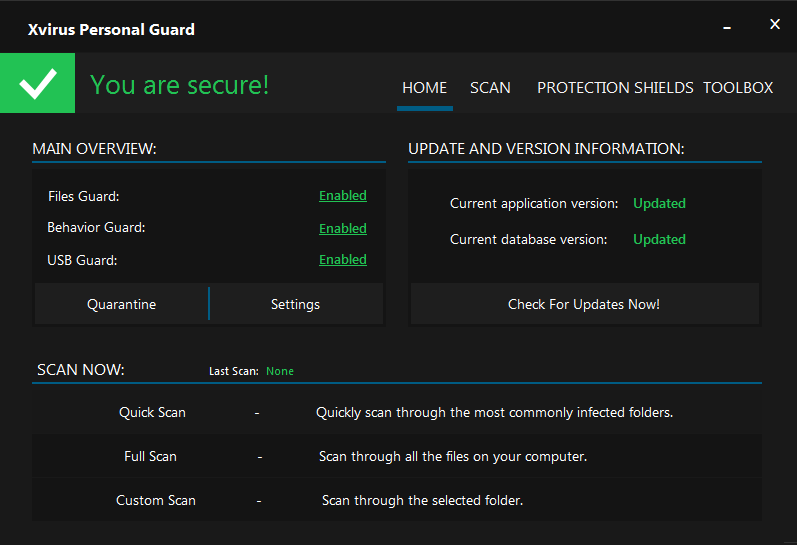
Neither.
The first is original to your current, but lacks co-ordination (ie. placement) of elements/text.
The second appears out of the blue and looks similar to Emsisoft (light vs dark). It's also too cluttered with text.
The main GUI should be simple and easy to navigate / understand. Try using icons to illustrate product status, instead of "Enabled" or "Updated".
For example:
Current version: 5.0.124.0 (new version available!) [!]
Definitions version: 1234 (Last checked 24 minutes ago) [<tick>]
Edit: No version info is shown in 2nd UI.
")