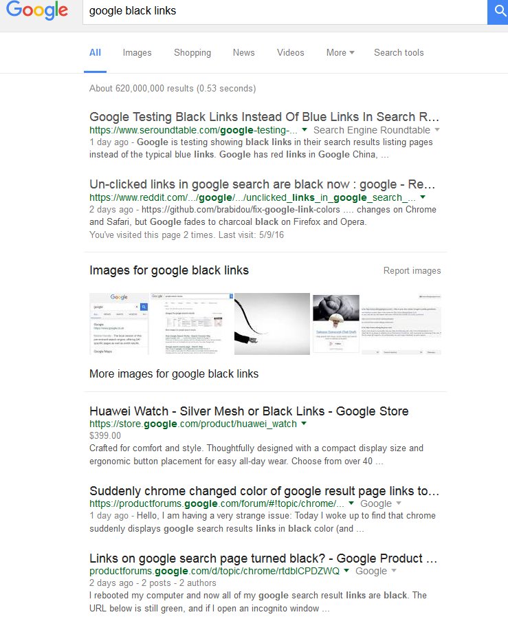
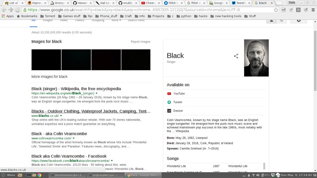
Google searches could soon look very different: the company is testing a new version of its results page featuring black links, in the place of the familiar blue.
Users began reporting the visual change on Sunday, suggesting that Google is embarking on one of its famous “A/B tests”. The company regularly makes a small change for a subset of users, examining how they respond before deciding whether or not to roll it out to the wider userbase.

 —
—
Other users, like Business Insider’s Rob Price, have noticed a different test taking place, between two shades of blue for the search links.

Paying attention to the little things has paid off for Google in the past. Famously, when it decided to introduce adverts on Gmail, it ran a test to pick between 40 different shades of blue.
In 2014, Google UK’s managing director, Dan Cobley, said what happened next: “We saw which shades of blue people liked the most, demonstrated by how much they clicked on them. As a result we learned that a slightly purpler shade of blue was more conducive to clicking than a slightly greener shade of blue, and gee whizz, we made a decision.
“But the implications of that for us, given the scale of our business, was that we made an extra $200m a year in ad revenue.”
Switching the links from blue to black is a far larger change. So if Google does upgrade it from test to feature, you can be sure there’s a lot of money to be made in doing so.
Users began reporting the visual change on Sunday, suggesting that Google is embarking on one of its famous “A/B tests”. The company regularly makes a small change for a subset of users, examining how they respond before deciding whether or not to roll it out to the wider userbase.


Other users, like Business Insider’s Rob Price, have noticed a different test taking place, between two shades of blue for the search links.

Paying attention to the little things has paid off for Google in the past. Famously, when it decided to introduce adverts on Gmail, it ran a test to pick between 40 different shades of blue.
In 2014, Google UK’s managing director, Dan Cobley, said what happened next: “We saw which shades of blue people liked the most, demonstrated by how much they clicked on them. As a result we learned that a slightly purpler shade of blue was more conducive to clicking than a slightly greener shade of blue, and gee whizz, we made a decision.
“But the implications of that for us, given the scale of our business, was that we made an extra $200m a year in ad revenue.”
Switching the links from blue to black is a far larger change. So if Google does upgrade it from test to feature, you can be sure there’s a lot of money to be made in doing so.