MalwareTips 2.0 Dark version - Feedback from our members!

Status
Not open for further replies.

Jack

Administrator
Thread author
Verified
Staff Member
Well-known
Jan 24, 2011
9,378
Hello,
I know that some of you requested a black version of our new layout - MalwareTips New Theme (Feedback and Testing for Members), so here it is.
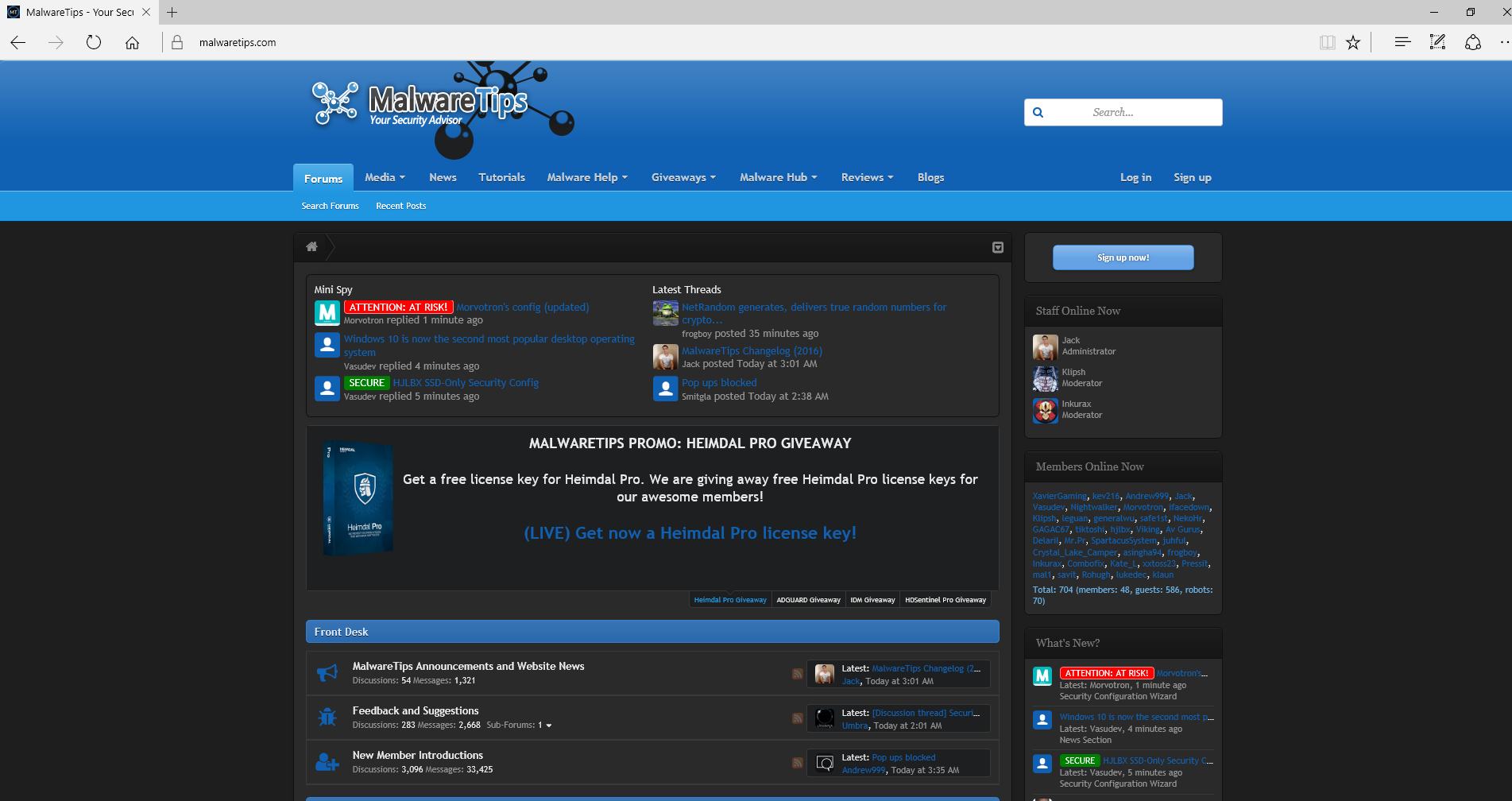
New Dark Layout.jpg


How to use the new theme:
1. Go to the MalwareTips footer, and click on "MalwareTips Style".
1-jpg.85416

2. From the pop-up menu (Style Chooser), select the "MalwareTips 2.0 Dark version" theme.
testing.jpg


Let us know if you like this new layout, and what you think (if any) should be changed.
 
Last edited:

tonibalas

Level 40
Verified
Honorary Member
Top Poster
Well-known
Sep 26, 2014
2,973
@Jack i am trying right now and i must say i really like it.
In comparison with the classic Dark theme this is much better the letter's in the posts are more bright
and much easier to read.
In the new version i can see in the avatar if a member is online or not.
One of the two- Dark theme 2.0 and the new 2.0 (Beta testing )- is going to be my default theme but which one i will decide the next days;)
Nice work MT staff and thanks for listening to us:)
 
Last edited:
N

Noxx

It's that kind of theme you want to use when it's late at night and you're tired and don't want a bright screen hurting your eyes. I will however say that the header being all blue like that and the rest of the page being so dark feels a bit awkward. Putting that aside, not bad. Here's what I would do:

- Keep everything else below the header as it is. It's perfect.
- Remove the blue background and make it LIGHT grey.
- I think the blue navigation tabs can stay blue.
- Make the "MalwareTips" text ALL blue, but keep "your security advisor" white.
- My last suggestion is a big one, but again I'm just throwing it out there, and that's to make the "dark blue" text on the forum brighter. Maybe baby blue? I think this would solve a lot of the concerns here regarding it being hard to read.

Take it or leave it. In any case, good job. :)
 
Last edited by a moderator:
  • Like
Reactions: OokamiCreed

jamescv7

Level 85
Verified
Honorary Member
Mar 15, 2011
13,070
Dark theme is my favorite perspective view throughout its design :) , only little concern from now is that the font color blue seems not to blend well like on the following areas:

  • Mini spy
  • Latest threads
  • Even font color from names who likes the post
  • Others which may pertain to have little issue on color blend

Because others are fine with white font color alongside of hitch bold type, although I should respect the familiarity of functions and its coded appearance.
 
  • Like
Reactions: OokamiCreed
N

Noxx

Oh my goodness, that is SO much better. The only other thing I would recommend, and again, it may just be me, and that's a slightly brighter blue font. Otherwise, fantastic job!
 

OokamiCreed

Level 18
Verified
Honorary Member
Top Poster
Well-known
May 8, 2015
881
This dark theme (unlike the last one) has online status on a users profile pictures (something only the light theme had before). Theme looks flat and modern and in general easier to navigate. No complaints from me. Like this better than the other dark theme.
 

upnorth

Level 68
Verified
Top Poster
Malware Hunter
Well-known
Jul 27, 2015
5,458
Sigs and member info should IMO be shown by default. The option to hide/collapse is great but for new members or people that normaly never used forums it could be confusing.
 
Last edited:
  • Like
Reactions: Rebsat and frogboy
D

Deleted member 178

When selecting a choice in the SCW fields, The font and background color are too close, unreadable.

6KCVqev.png
 
  • Like
Reactions: Noxx
D

Deleted member 178

Also, all links & spoilers in my Signature are disabled, clicking on them do nothing.
 
Status
Not open for further replies.

About us

  • MalwareTips is a community-driven platform providing the latest information and resources on malware and cyber threats. Our team of experienced professionals and passionate volunteers work to keep the internet safe and secure. We provide accurate, up-to-date information and strive to build a strong and supportive community dedicated to cybersecurity.

User Menu

Follow us

Follow us on Facebook or Twitter to know first about the latest cybersecurity incidents and malware threats.

Top