Microsoft’s upcoming Office apps UI looks amazing

Gandalf_The_Grey

Level 83
Thread author
Verified
Honorary Member
Top Poster
Content Creator
Well-known
Apr 24, 2016
7,260
Microsoft Office Fluent Design

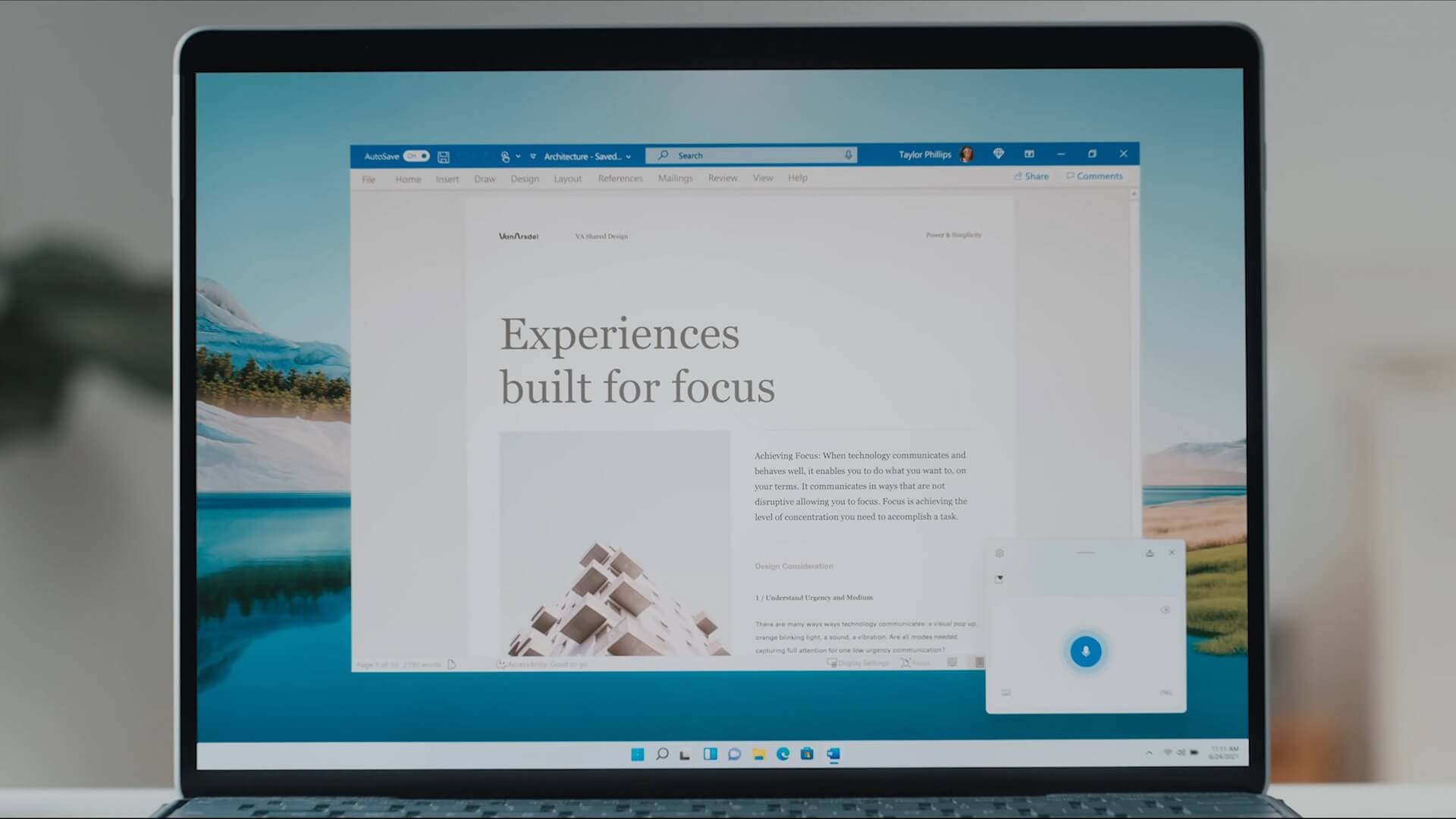
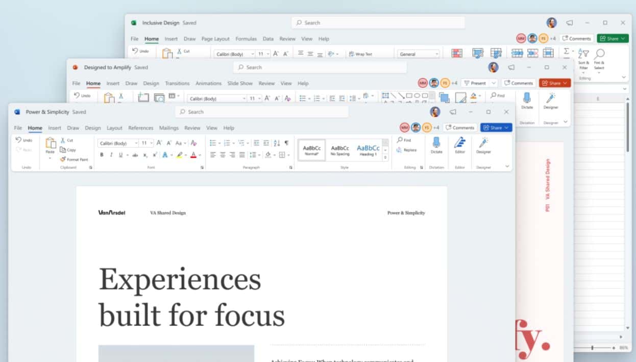
Microsoft yesterday announced the new Windows 11 OS that comes with a redesigned Start menu, improved task bar experience and more. With Windows 11, Microsoft is revamping several in-box apps with modern Fluent Design-based UI. Last night, we reported about new File Explorer, Settings UI, Notepad, Paint, and more. Microsoft yesterday also offered a sneak peak at the upcoming Office apps UI.

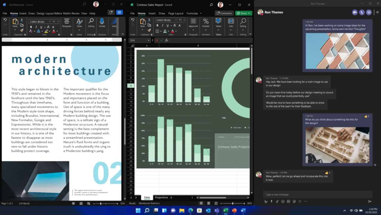
Microsoft Office apps will continue to have Ribbon UI, but the Ribbon UI will now feature new icons based on Fluent Design system. As you can see from the image above, the upcoming UI looks clean and modern. With Windows 11, Microsoft Office now matches your Windows theme so you can enjoy the visual refresh in whichever Office theme you prefer, including Dark mode, white, colorful, or dark grey.
Microsoft Office windows 11

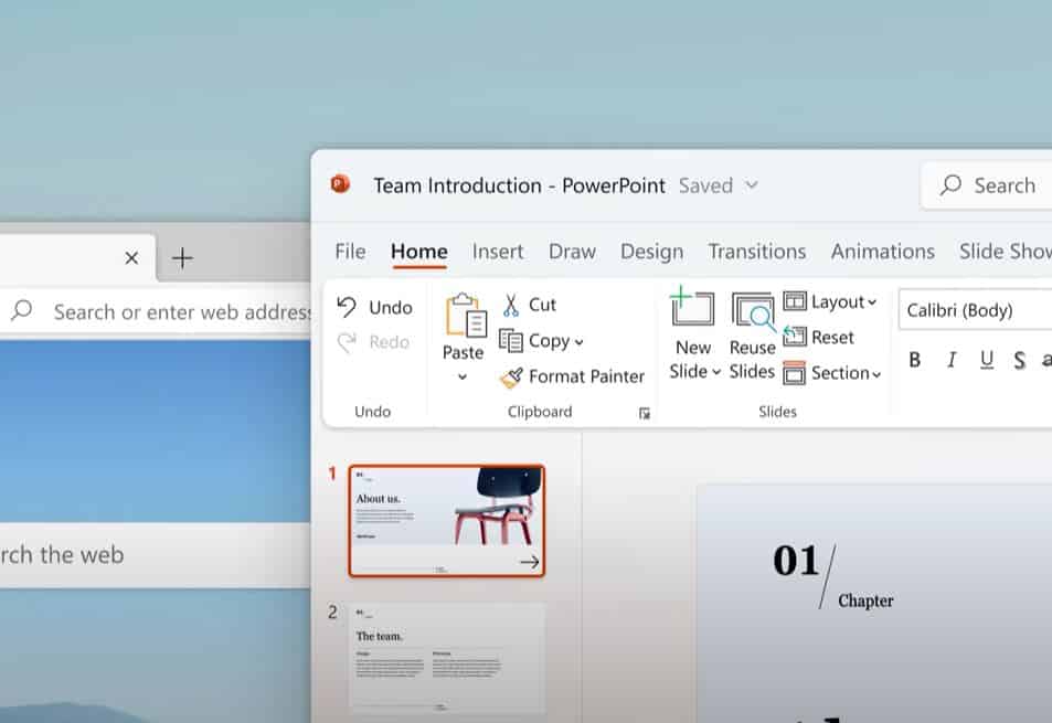
In the coming months, Microsoft will release the updated Office apps for consumers. When Windows 11 launches later this year, you can expect the redesigned Office apps in Microsoft Store.
 

Gandalf_The_Grey

Level 83
Thread author
Verified
Honorary Member
Top Poster
Content Creator
Well-known
Apr 24, 2016
7,260

Microsoft announces a major visual update for Office apps on Windows:​

Microsoft Office apps refresh
Aligning with the release of the first Windows 11 Preview Build today, Microsoft today announced a major visual update for Office apps on Windows. This visual update delivers a simple and more coherent experience across the Office apps.
With this update, we deliver an intuitive, coherent, and familiar user interface, using the Fluent Design principles, across all your applications: Word, Excel, PowerPoint, OneNote, Outlook, Access, Project, Publisher, and Visio.
This visual refresh is now available to any Office Insiders running Beta Channel builds 14228.20000 or later on Windows 11 or Windows 10.

How it works​

This visual refresh will be automatically available to any Office Insiders running Beta Channel builds. It can easily be turned off using the Coming Soon feature, located in the top right corner of the menu. In Word, Excel, PowerPoint, or OneNote, simply click the megaphone icon to open the Coming Soon pane, read more about the visual refresh changes, and use the toggle to move between the new and current interface, and apply the setting to all the Office apps.
screenshot showing Coming Soon feature

Coming Soon feature​
Also note that:
  • The Coming Soon feature is not available in Access, Project, Publisher, or Visio. If you turn on the visual refresh in any of the 4 apps mentioned above (Work Excel, PowerPoint, or OneNote), it will also be available in these 4 apps.
  • Though the Coming Soon feature is available in Outlook, it can’t be used to turn the visual refresh on and off. If you turn on the visual refresh in any of the 4 apps mentioned above (Work Excel, PowerPoint, or OneNote), it will also be available in Outlook.

Scenarios to try​

  • Create your pitch deck in PowerPoint while referencing Word and Excel for the information you need. Notice the default neutral color palette, customizable ribbon, and soft corners, across these three apps.
    Visual refresh in Excel and PowerPoint

    Working on Excel and PowerPoint on Windows 11​
  • Share your presentation using Outlook and notice the cohesive interface which helps you stay in the flow.
    Visual refresh in Outlook

    Sharing a deck in Outlook on Windows 11​
  • Review a blog draft you had written in Word with your teammates. Notice the colorful presence indicators in the top right corner of the menu bar, which help you quickly find where your teammates are co-authoring in real time.
    Visual refresh in Word

    Collaborating in Word on Windows 11​

Tips & Tricks​

  • Office theme: Office now matches your Windows theme so you can experience the visual refresh in whichever Office theme you prefer, including black (Dark Mode), white, colorful, or dark grey.
    Visual refresh of Dark mode in Word

    Word and Windows 11 in Dark Mode​
  • Quick Access toolbar: It is now hidden by default to make your interface simpler. To display it again, simply right-click the ribbon or click the Ribbon Display Options icon, and then click Show Quick Access Toolbar.

Known issues​

  • The team’s focus has been on primary app surfaces like the ribbon and document canvas. As a result, there will still be some color and style inconsistencies across different UI surfaces. The backstage (i.e. File menu) is not yet updated.
  • There is currently a bug with animations in our apps on Windows 11, which can make transitions look less polished.
  • The Mica background effect has not yet been added to our apps. It will be coming in a future update.
  • The preview gallery for Data types and Shapes have a color bug in dark grey theme. Please expand the gallery to view contents while we resolve this issue.
  • There is a bug where the document title appears misaligned within the title bar.
Source: Microsoft
MS blog post:
 

About us

  • MalwareTips is a community-driven platform providing the latest information and resources on malware and cyber threats. Our team of experienced professionals and passionate volunteers work to keep the internet safe and secure. We provide accurate, up-to-date information and strive to build a strong and supportive community dedicated to cybersecurity.

User Menu

Follow us

Follow us on Facebook or Twitter to know first about the latest cybersecurity incidents and malware threats.

Top