silversurfer
Super Moderator
Thread author
Verified
Top Poster
Staff Member
Malware Hunter
Forum Veteran
- Aug 17, 2014
- 12,743
- 123,908
- 8,399
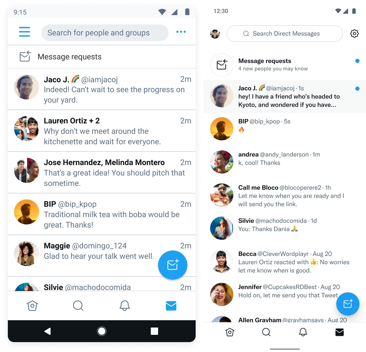
Twitter is launching a redesigned user interface for DMs on Android, the company announced on Friday. Starting today, Twitter users on Android will see a more modern interface for direct messages that is consistent with the rest of the app. With this roll out, Twitter is bringing the Android experience on par with its iOS interface.
The refresh also brings an improved composer, as well as better Tweet forwarding, context for message requests and clearer read receipts. The social network is also introducing improvements to the interface’s scrolling performance and responsiveness.
Now, when Android users open up their DMs, they will no longer see the boxy design that they’re used to. You will now also see if you have received message requests from people you may know. The three-dot menu in the top right corner of the UI has also been replaced with a Settings symbol.

Image Credits: Twitter

Twitter is rolling out a refreshed user interface for DMs on Android
Twitter is launching a new redesigned user interface for DMs on Android, the company announced on Friday