Xvirus 5.0 new UI (poll)
- Thread starter Dani Santos
- Start date
You are using an out of date browser. It may not display this or other websites correctly.
You should upgrade or use an alternative browser.
You should upgrade or use an alternative browser.

D
Deleted member 21043
Definitely the second one. ")
@Paul Lee Do you just favour my designs? Haha, because you liked Virfree UI on my thread and I designed the Firewall UI which is based off the second UI here
Neither.
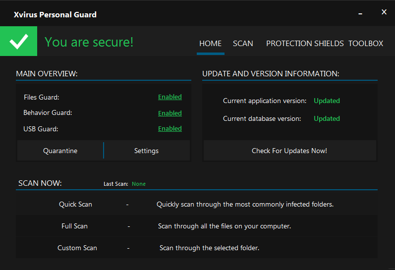
The first is original to your current, but lacks co-ordination (ie. placement) of elements/text.
The second appears out of the blue and looks similar to Emsisoft (light vs dark). It's also too cluttered with text.
The main GUI should be simple and easy to navigate / understand. Try using icons to illustrate product status, instead of "Enabled" or "Updated".
For example:
Current version: 5.0.124.0 (new version available!) [!]
Definitions version: 1234 (Last checked 24 minutes ago) [<tick>]
Edit: No version info is shown in 2nd UI.
Anything you make is good in my books buddyDefinitely the second one.
@Paul Lee Do you just favour my designs? Haha, because you liked Virfree UI on my thread and I designed the Firewall UI which is based off the second UI here
Neither.
The first is original to your current, but lacks co-ordination (ie. placement) of elements/text.
The second appears out of the blue and looks similar to Emsisoft (light vs dark). It's also too cluttered with text.
The main GUI should be simple and easy to navigate / understand. Try using icons to illustrate product status, instead of "Enabled" or "Updated".
For example:
Current version: 5.0.124.0 (new version available!) [!]
Definitions version: 1234 (Last checked 24 minutes ago) [<tick>]
Edit: No version info is shown in 2nd UI.
Ill take that into consideration, but why does it look like emsisoft? Now every UI that is colorfull looks like emsisoft?
- Jul 12, 2014
- 1,143
- 7,365
- 2,079
- 33
@Dani Santos
I believe that @Huracan meant maybe e.g. "Tabs section (main navigation)" and not colors.
Navigation is a little bit similar to Emsisoft but anyway, I like it.. Just my opinion.")
Regards,
Kardo
Now every UI that is colorfull looks like emsisoft?
I believe that @Huracan meant maybe e.g. "Tabs section (main navigation)" and not colors.
Navigation is a little bit similar to Emsisoft but anyway, I like it.. Just my opinion.
Regards,
Kardo
M
Manzai
i agree with @Huracan, the first its really good only try add icons for get a touch PRO and nice
btw. if you wanna i can help u with graphics resources.
btw. if you wanna i can help u with graphics resources.
You may also like...
-

-
DCopilot on Windows: New text editing feature begins rolling out to Windows Insiders
- Started by Donna Little
- Replies: 0
-
 Serious Discussion LockBit 5.0 Is Back — Stronger, Sneakier, More Dangerous
- Started by Bot
- Replies: 5
-
 New Update Firefox’s Tab Notes Feature Feels Genuinely Useful (For Me, At Least)
- Started by lokamoka820
- Replies: 1
-
DFull screen experience expands to more Windows 11 PC form factors for Windows Insiders
- Started by Donna Little
- Replies: 2