Definitely it looks very nice to me!Hey guys,
On the site we're trying a variant of the logo with a slightly darker shade of blue.
View attachment 188720
")
")
Definitely it looks very nice to me!Hey guys,
On the site we're trying a variant of the logo with a slightly darker shade of blue.
View attachment 188720
the colours look washed out/faded, too pale, peelly wally (as we say here) if they were much deeper then yes.yes this what i meant by making it "darker" , i should use the term "vivid"Hmmm, i'm not sure
The blue T looks better. this gray one does not show up very well in the browser tab. Edge. You can see it but it is faint.
View attachment 188822
Hey guys,
For me option 2 a red/burgundy M and a blue T looks the best.Hey guys,
Yes, the favicon will get a dark background and be visible in the browser tabs. I've spent so much time focusing on the logo in the header that I've forgot that it's in other parts also.
As you may haven noticed we're trying two new colors:
1. The M in a darker shade of orange:
View attachment 188834
2. And the "M" in a red/burgundy color.
View attachment 188833
The "T" can be any color that looks good with the "M", however since we don't want the logo to get all the attention we're trying to decide between grey (currently in site header) or the above blue.
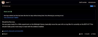
Should be fine now.Not logo related, but this has been like this for days without being fixed. Not affecting by zooming in/out.
View attachment 188883
I guess it's just temporally
I like the Decepticon logo
I haven't decided on the colors yet. I like all the combinations but I also like how clean the header looks without the logo image. On the other hand we always had a blue logo so moving to orange or red is a big step.No logo anymore? Takes time to get used to.
It's like loosing your hair.
I haven't decided on the colors yet. I like all the combinations but I also like how clean the header looks without the logo image. On the other hand we always had a blue logo so moving to orange or red is a big step.

Actually I've moved to BETAX after my last post just to see how will it look after I apply dark colors on it, it looks amazing.Should be fine now.
Are you guys ready for a little experiment on the Midnight theme, basically move the user info on top like it's currently on the BETA X? This should make posts more easy to read with the sidebar enabled.