Crystal Security 3.5

Status
Not open for further replies.

Kardo Kristal

From Crystal Security
Thread author
Verified
Top Poster
Developer
Well-known
Jul 12, 2014
1,143
Hello Kardo,
I found a bug with the lastest version of Crystal Security :
when I close task manager, Windows (7, x64) said that it don't close properly.
I can upload you captures but they're in french.

@TheSuperGeek It is a known issue and it is caused by Self-protection. I have one idea how to fix/improve Self-protection. In the next version it should be solved. When you disable Self-protection then the issue is gone. Thanks. :)

Regards,
Kardo
 
T

TheSuperGeek

Hello,
I follow the tutorial of kram7750 but I wan't to know if it's possible to start Crystal Security without start the main interface, and I selected "start on user login" => it shome me UAC at login and show me the main UI...

@Kardo Kristal : the Notification design is great but the background don't look right with the main UI.... if you plan to change main UI...

Thanks for the great product that serve me very well !
 

Kardo Kristal

From Crystal Security
Thread author
Verified
Top Poster
Developer
Well-known
Jul 12, 2014
1,143
Thank you for the feedback. :) @TheSuperGeek
Hello,
I follow the tutorial of kram7750 but I wan't to know if it's possible to start Crystal Security without start the main interface, and I selected "start on user login" => it shome me UAC at login and show me the main UI...

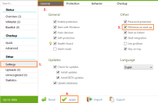
You can minimize (hide) main UI with the following option under Settings: Minimize on start-up. Enable it and click Apply to activate feature.

minimize_on_start_up-png.57313


@Kardo Kristal : the Notification design is great but the background don't look right with the main UI.... if you plan to change main UI...

Okay. ;)

Thanks for the great product that serve me very well !

Thank you for your kind words. :)

Regards,
Kardo
 

Attachments

  • Minimize_on_start_up.png
    Minimize_on_start_up.png
    23.2 KB · Views: 630

Kardo Kristal

From Crystal Security
Thread author
Verified
Top Poster
Developer
Well-known
Jul 12, 2014
1,143
Hi,

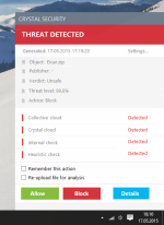
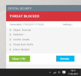
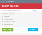
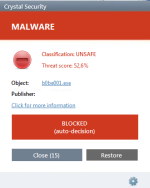
Preview of updated notification(s). Two types of notifications (based on settings).

1. User decision is required

notification_user_decision-png.57597


2. Blocked automatically

notification_auto_decision-png.57599


Feedback is welcome. :)

Regards,
Kardo
 

Attachments

  • Notification_user_decision.png
    Notification_user_decision.png
    107.8 KB · Views: 463
  • Notification_auto_decision.png
    Notification_auto_decision.png
    58.4 KB · Views: 462
Last edited:

Kardo Kristal

From Crystal Security
Thread author
Verified
Top Poster
Developer
Well-known
Jul 12, 2014
1,143
It's terrible if compared with the previous concept (the background was nice).

@Malware1 Hehe. :D, Thanks for the information. PS. There was actually a reason why I decided to update it again (mainly because of the different results. Red color with same background = not good at all).
Very good concept, you may enforce this already as possible. ;)
@jamescv7 Thanks for the feedback. ;)
Kardo, let use decide the UI on Settings (for alerts). They are both great.
@kram7750 It could be one option but it adds more workload. Currently there is no plan but suggestion is good. :)
Very good UI. Can you add small border because for users who have white background this will be little unpleasant.
@FireShootSK Thanks for the suggestion.

Regards,
Kardo
 
Last edited:
S

Sr. Normal

Hi

I would not change the UI. That offer you now is good, but I'm ls who think that if something is good, why change it ?. I think the new user prefer to have 2 buttons.

I do not know ... I love Crystal Security and this change... I do not like it. I'm not saying that is not good, but the previous UI is very difficult to improve. I mentioned recently that I noticed that you had changed a little shade of red. I found a successful change, yet this change does not please me. That red strip below changes everything

But it is just my opinion


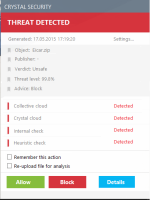
upload_2015-5-17_18-27-3.png upload_2015-5-17_18-27-36.png upload_2015-5-17_18-28-2.png
 
D

Deleted member 21043

Hi

I would not change the UI. That offer you now is good, but I'm ls who think that if something is good, why change it ?. I think the new user prefer to have 2 buttons.

I do not know ... I love Crystal Security and this change... I do not like it. I'm not saying that is not good, but the previous UI is very difficult to improve. I mentioned recently that I noticed that you had changed a little shade of red. I found a successful change, yet this change does not please me. That red strip below changes everything

But it is just my opinion


View attachment 57540 View attachment 57541 View attachment 57542
Kardo should allow us to choose the UI for alerts. Problem solved. :)
 
Status
Not open for further replies.

About us

  • MalwareTips is a community-driven platform providing the latest information and resources on malware and cyber threats. Our team of experienced professionals and passionate volunteers work to keep the internet safe and secure. We provide accurate, up-to-date information and strive to build a strong and supportive community dedicated to cybersecurity.

User Menu

Follow us

Follow us on Facebook or Twitter to know first about the latest cybersecurity incidents and malware threats.

Top