Experiment: Card Type Layout For New Posts/Threads on Main Page

Gandalf_The_Grey

Level 76
Thread author
Verified
Honorary Member
Top Poster
Content Creator
Well-known
Apr 24, 2016
6,566
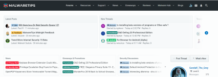
Don't like the top 2 rows where you have to click on the arrow to see more.
MalwareTips.PNG
I don't quite remember how it was before but we didn't have to navigate with an arrow.

EDIT: This thread was created by moving posts from this topic: Feedback - MalwareTips Default Style (2018) Feedback
 
Last edited by a moderator:
L

Local Host

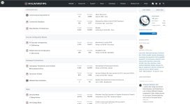
I don't like the clutter that is being added on the default theme, more and more widgets are being added. A good example is what Gandalf pointed out in the comment above.

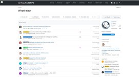
Even the "What's New" page is now cluttered with this widgets, it makes navigating the Community more complex and wastes space.

I would like at least an option to remove all the widgets and make the Community as simple as possible, I can always resort to Tampermonkey to make the changes myself otherwise.


Fixed for myself already,

IMG00.jpg

IMG01.jpg
 
Last edited:

Jack

Administrator
Verified
Staff Member
Well-known
Jan 24, 2011
9,378
Hello to all,

Don't like the top 2 rows where you have to click on the arrow to see more.
View attachment 197280
I don't quite remember how it was before but we didn't have to navigate with an arrow.

Previously the first row contained the Last Threads & New Posts cards, while right now this row delivers 5 more cards for our members. The cards after the Last Threads & New Posts offer content that is updated more rarely so in normal conditions there is no need to scroll all the time. Even so I understand that this gesture is not natural for non-touch devices, so I'll see what can be done for this row. Maybe I'll switch back to the previous version, or try a box with tabs.

The second row is a new addition and basically shows the last 3 posts from different forums. It makes it easy for our members to find content, and because it has a high number of cards, there was no other solution than this"scroll" trick.

Overall the benefits that these 2 rows bring outweighs the drawbacks.

Even the "What's New" page is now cluttered with this widgets, it makes navigating the Community more complex and wastes space.

I would like at least an option to remove all the widgets and make the Community as simple as possible, I can always resort to Tampermonkey to make the changes myself otherwise.


Yes, on the What's New page we've added more sections that what Xenforo offers as standard, however the aim was to make it easier for our members to find different content. I'll review again this page and see what can be removed and what should be kept.

For the main page, it's not very complex we just added these 2 sections... Truth be told, it should have been a lot more complex, but lately I didn't had any time to make more complex customization!


Thank you for the feedback.
 
Last edited:

oldschool

Level 81
Verified
Top Poster
Well-known
Mar 29, 2018
7,099
I have sat with this new upper main page format but I'm going to give it some more time before giving another overall opinion. I think the two most important categories are easily visible/accessible but it does mean those who like the other categories have to scroll to see them. Other posters have valid points.
 

Jack

Administrator
Verified
Staff Member
Well-known
Jan 24, 2011
9,378
I have sat with this new upper main page format but I'm going to give it some more time before giving another overall opinion. I think the two most important categories are easily visible/accessible but it does mean those who like the other categories have to scroll to see them. Other posters have valid points.
Hey oldschool,
Just as note you can also click & hold the main mouse button and swipe through the cards. Like I've said most likely for the first box (with the Latest Posts) I will either switch back to the previous version, or try a box with tabs. I didn't change it yet because I want more members to test it.
 

About us

  • MalwareTips is a community-driven platform providing the latest information and resources on malware and cyber threats. Our team of experienced professionals and passionate volunteers work to keep the internet safe and secure. We provide accurate, up-to-date information and strive to build a strong and supportive community dedicated to cybersecurity.

User Menu

Follow us

Follow us on Facebook or Twitter to know first about the latest cybersecurity incidents and malware threats.

Top