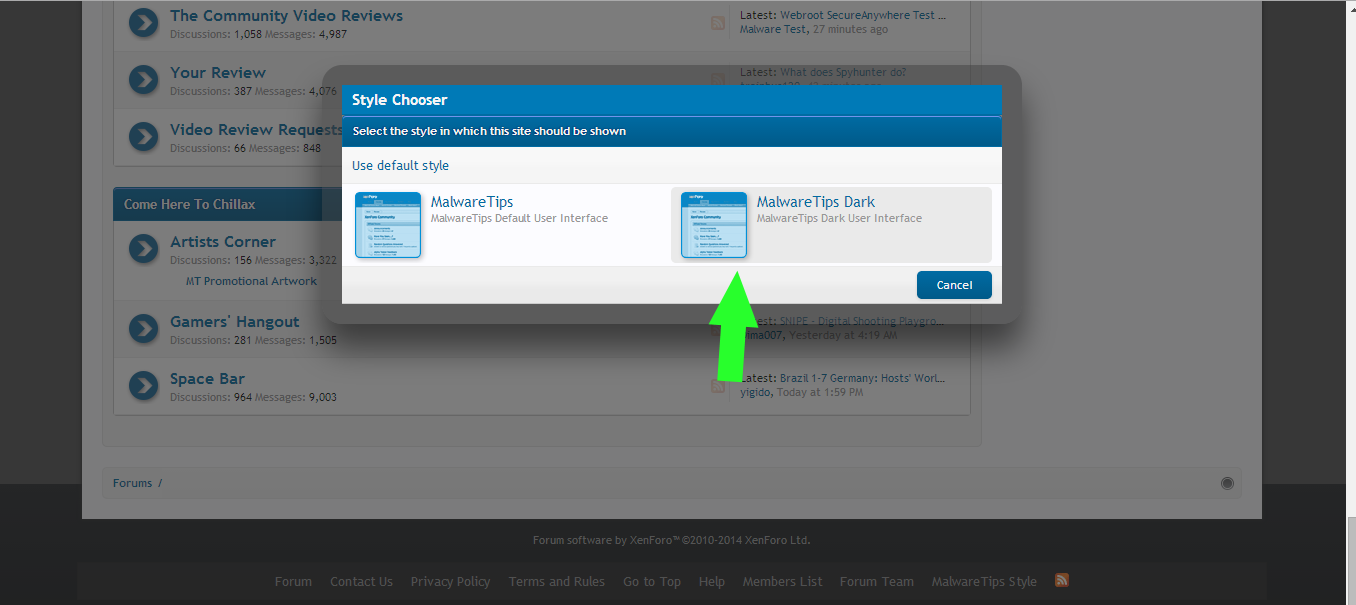
From another thread:
'Perhaps a theme with some darker greys would work, black is perhaps a bit too much ..' - I'm with you, Cowpipe!
The black skin has lack of legibility, visibility, for me.
To increase the readability of the MT black skin - I'd love to, eg .:
- enlarge the font,
- apply color changes, eg. instead of gray (this is gray, not white font, I see) - to light yellow.
Look at this picture, for good example:
This blue font is well readable, and you could have it so much better readable in yellow, from the right example!.jpg
- Anything to comment, please?

PS.
- could it be possible to merge these two 'dark theme' topics, please?
Edit:
- found this (interesting) read:
Yellow filters in eye result in higher visibility, UGA research finds :
http://news.uga.edu/releases/article/yellow-filters-in-eye-result-in-higher-visibility/
'- Human eyes naturally contain yellow pigment in the macula, a spot near the center of the retina responsible for high-resolution vision. Those with more yellow in their macula may have an advantage when it comes to filtering out atmospheric particles that obscure one's vision, commonly known as haze. According to a new University of Georgia study, people with increased yellow in their macula could absorb more light and maintain better vision in haze than others.' ..
.. and another read:
Readability – making web pages easy to read :
http://webdesignfromscratch.com/basics/readability/
'Contrast in text
It’s very important to have sufficient contrast between text and its background. Use white background with black body text where possible. If not, black on the lightest background colour you can manage. An alternative is white or brightly-coloured text on a black or very dark background colour ..'
'Actually, studies have been done and found that black text on yellow background are the easiest to read.'
Free Online Readability Calculator :
https://readability-score.com/ - test on 'URL' home page ..
The Readability Test Tool :
http://read-able.com/


