Metro Version of MalwareTips Updated

Malware Maniac

Level 1
Thread author
May 14, 2012
673
44
33
U.S.A.
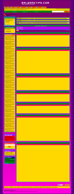
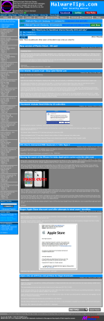
I made a metro styled version of MalwareTips which is practically a copy and paste from the ProBlack theme but with more colors. I just used screen capture by Google, captured the page, edited it, and removed unnecessary bytes with smush it by yahoo.

Hope you enjoy.


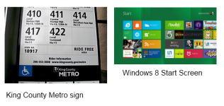
I removed the less bright metro style of MalwareTips in Metro and replaced it with the new one. Which I guarantee is not as painful for the eyes as the original. It looks a little like MrXidus' Metro Version but not much.
 

Attachments

  • MalwareTips In Metro Style.png
    MalwareTips In Metro Style.png
    171.4 KB · Views: 639
  • Metro+New.png
    Metro+New.png
    870.5 KB · Views: 633
RE: Metro Version of MalwareTips

Pink and yellow hurts the eyes quite a bit. Consider using some colours like green or blue (light)
 
RE: Metro Version of MalwareTips

Sorry for the bad choice of colors I will make a new one. Just give me a little bit of time.

The issue has be "Adjusted"
 
RE: Metro Version of MalwareTips

the colors are cool and unique
but most of the people need something easy one the eye (Less creative)
so it will be easier to Read


Keep up the Good work
 
McLovin said:
If you try to pick colours that aren't to bright then it will look okay ;)

Well I tried sorry if both of them are too bright. I admit the first one is too bright but not much of the second one.
Well you can't please everyone.
 
Like others said the color itself is likely bright so try some cool colors. Try and adapt like on the Windows Metro Interface thing, :D
 
Microsoft's design team says that the Metro UI is partly inspired by signs commonly found at public transport systems [...] Metro places emphasis on good typography and has large text that catches the eye.

[attachment=1337]
source: Wikipedia

Examples of websites ispired by Metro UI.

I think that the focus should be on content and usability not on the chrome in any website design. There is a good book on design Don't make me think by Steve Krug. And a blog post inspired by the book. My personal opinion is that text/content is the most important thing on a forum and if the design uses too many colors, is too flashy, buttons and colors catch your attention instead of the actual text, it just won't work. It's not about making it look good but about making it easy to read.
 

Attachments

  • Metro.png
    Metro.png
    104.2 KB · Views: 594
Malware Maniac said:
More like you can't please anyone I'm about to delete the images.

don't surrender, just improved what you did. You can take example with the light colors of the nova theme (white, light blue, etc...)
 
@Malware Maniac: It doesn't matter if people like it or not, the important thing is that you try designing it and you learn something from it.

Many people dislike the new Win8 interface, usually people don't like changes because they need to learn something new... like why there is no Start button in windows 8? :) But without changes there wouldn't be any progress. We'll know in a couple of years if the new Metro style is good or not.
 
Malware Maniac said:
More like you can't please anyone

One does not simply become great at what he does. Ask anyone with a great skill and they'll say it takes time, practice and more practice to get where they are. Keep doing what you enjoy doing and forget the rest. Be optimistic and use feedback to help yourself improve your expanding skills. :)
 

You may also like...