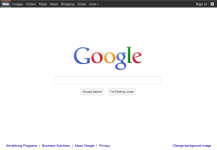
Google redesigns homepage
- Thread starter Ink
- Start date
You are using an out of date browser. It may not display this or other websites correctly.
You should upgrade or use an alternative browser.
You should upgrade or use an alternative browser.
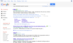
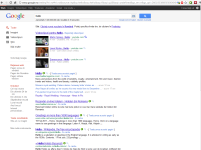
Same here.K__M said:Mine does not look like that. It just has a new black bar at the top.
[attachment=528]
Google has started adding the "+1" button to all their pages around the world (eg : .fr,.it,.ro .. ) so they need it to point out this new feature with a small redesign.Looks good....Google has a very simple and professional look for their page so any change is always easy to spot
Attachments
Last edited:
It has been proven that people will always like the "new" ....Google has a good designing team so it won't be a surprising if most of the people will like it.jamescv7 said:Me too a black bar and I like the new layout than before.
I can tell you that if : after 6months Google will release a new design and we will ask the users again : "Do you like it more than the previous one?" , most will say : "Yes, it looks awesome!"
I use Chrome and the bar is white, but with IE9 the bar is black.
I do see from Jack's screenshot he is using Chrome, but still uses the black bar. :huh:
I've signed up to be notified about Google+.
Do you agree that Google's white, bright colours have partially kept the company with a good reputation? - I do.
I do see from Jack's screenshot he is using Chrome, but still uses the black bar. :huh:
I've signed up to be notified about Google+.
Do you agree that Google's white, bright colours have partially kept the company with a good reputation? - I do.
Seems its like all browser will shown black bar, I tested in Google Chrome in laptop then its a black bar itself.
Google has released products built and designed by engineers.Google design was very simple and without any unneeded elements,Google Search site was designed with only one thing in mind : maximize the loading times.stormgtr said:Do you agree that Google's white, bright colours have partially kept the company with a good reputation? - I do.
Reportedly, within Google, when designers and engineers clashed over a product, the engineers usually won.
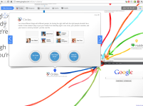
This new changes are a step forward when it comes to design,if you take a look at the official Google+ page you'll find a lot of colors and design elements which is something new for Google..
[attachment=530]
Start a demo
Attachments
Review: The modernized, refreshed Google interface
Google has created a stir recently by changing a lot of their services’ interfaces to co-inside with the announcement and private beta release of their Google+ social networking service. So today we’re sharing our opinions of the changes that Google has made, considering so many use their services, and giving our thoughts on what could be improved.
Read more
RE: Review: The modernized, refreshed Google interface
Google made the correct path on their brand new interface.
Google made the correct path on their brand new interface.
RE: Review: The modernized, refreshed Google interface
yep, look simple and cool now with black bar at above
jamescv7 said:Google made the correct path on their brand new interface.
yep, look simple and cool now with black bar at above
RE: Review: The modernized, refreshed Google interface
Google should learn from Apple......beautiful looking products "sell" better,the design is a important part of how successful a product will be.
According to Google this re-design is a project that will run over the next few months, and the users will continue to see more updates.
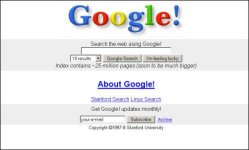
Google design evolution :
Original Google homepage in 1997
[attachment=537]
New Google homepage (2011) with a smaller logo and links moved to the top and bottom edges of the browser for a cleaner look
[attachment=538]
Attachments
You may also like...
-
Technology Google will soon redirect you to Google.com, no matter your country
- Started by Gandalf_The_Grey
- Replies: 4
-
Phishers abuse Google OAuth to spoof Google in DKIM replay attack
- Started by Gandalf_The_Grey
- Replies: 1
-
A.I. News Google confirms AI search will have ads, but they may look different
- Started by Brownie2019
- Replies: 3
-
Question Google "Results about you": Has any one used? How were your experiences?
- Started by Wrecker4923
- Replies: 3
-
77 Android apps on Google Play with 19 million installs spread malware, hitting 831 banks and exposing users to fraud and theft.
- Started by Brownie2019
- Replies: 1
