MalwareTips Wave - Our New Community Layout

Do you like the new MalwareTips Wave layout?

  • Yes, it's my default theme

  • No, previous default theme was better

  • I like & use MalwareTips Midnight

  • I like & use MalwareTips Rogue


Results are only viewable after voting.
this new interface looks very good.
only it would be good to be able to change the background to different colors, for example (black, brown, green, etc.).
super jack I appreciate the large contribution of work.(y):emoji_ok_hand:
 
Hey guys,
I'm really happy that the feedback is so positive. I'll take into account all of the above suggestions.


Today I've made some changes to the mobile part.

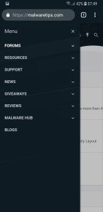
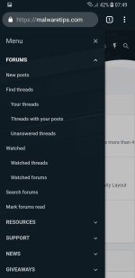
The mobile menu has been updated from a simple white background + black text to a new layout that matches the theme.

Screenshot_20181103-074943_Chrome.jpg
Screenshot_20181103-074946_Chrome.jpg


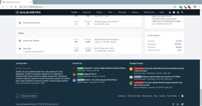
@bribon77 asked why he was getting a scrolling header menu. To give a better experience to users with smaller screens, I've increased the header menu breaking point from 900px to 1100px. So from now, the mobile menu will start from 1100px. Ref: http://screensiz.es/

Before:
1.jpg
After:

2.jpg
 
Thanks @Jack. I commented but then I saw the arrows to run:emoji_ok_hand:
Yes, it was a carousel that allows the full menu to stay in view, however if you have a device with a screen size of 1100px or lower I think that the mobile menu offers a much better layout.
 

You may also like...