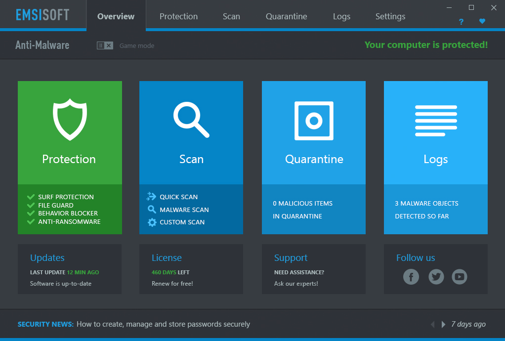
Sorry, haven't checked in a while and saw people are questioning the UI changes. So let me chime in for a bit.
There is actually a very good reason for the UI changes lately (there are even more in the release today). You may have noticed that the new menus are a lot more fluid and responsive than the old UI. The reason for that is, that they are actually rendered by a different UI toolkit that is capable of using hardware acceleration and multi-threading to make things a lot smoother and responsive. In addition it also is a lot more flexible when it comes to skinning or creating variations of the user interface colour scheme, allowing us to do things like the often requested dark mode. My favourite dark mode colour combo by the way is this one, but understand that this is not what it will look like when we release it:

I understand that the current "Franken UI" is probably not the best, but it's a starting point to iterate on. Also, if everything goes to plan, the UI changes are over soon. Maybe as soon as next release. Plus, there are a lot of technical changes in the queue as well. Some of them are in today's release, but that is just the berginning as we roll out more advanced technical features over the next few releases.