Hi all,
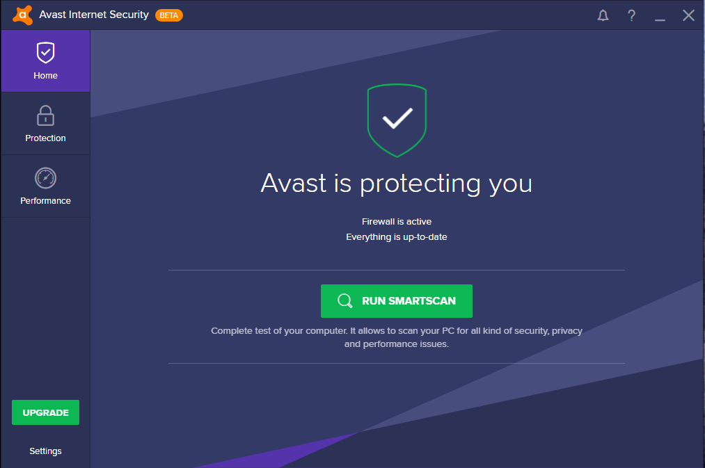
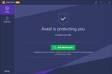
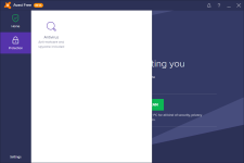
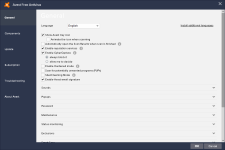
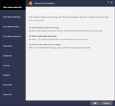
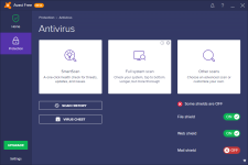
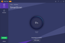
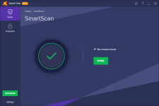
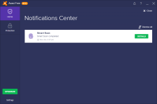
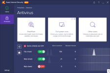
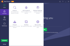
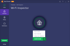
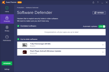
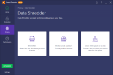
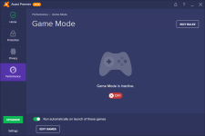
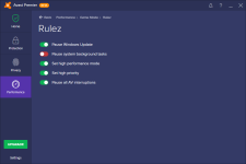
sorry for the delay with this beta, but it's finally here. We are now busy working on integration with AVG but I hope you will like the changes coming early next year (and yes HIPS included (wink) ) Main purpose of this beta to test its stability and get your feedback on the new UI. We didn't changed just the "face" but also the framework behind the UI so it gives us now much more flexibility in fixing various issues and bugs in the UI much faster than before.
We listened to the feedback, so there won't be color difference between Free and paid versions and all will be dark. Navigation moved back to the left side, and the window is now larger. We know it's not perfect now and we will work hard in the upcoming weeks to polish it for release quality.
Newest beta version: 12.4.2281
Changes:
+ Fully new UI framework with modern graphics
+ Removed screensaver and desktop gadget
+ Huge internal changes for product stabilization
Download links:
- BETA testing - Overview & Download links
Known issues:
+ Some UI parts are not fully finished yet, excuse glitches
+ SmartScan and Browser Cleanup not finished
+ UI glitches in some expiration messaging dialogs
+ Web shield problems on Win 10 internal preview
+ Passwords synchronization setup flows are broken
Share your feedback and opinions about the new UI here.
your Avast team
Last edited:
