Advice Request Help wanted: post feedback to Microsoft to fix bad UI-design

  • Thread starter Thread starter ForgottenSeer 92963
  • Start date Start date
Please provide comments and solutions that are helpful to the author of this topic.
F

ForgottenSeer 92963

Thread author
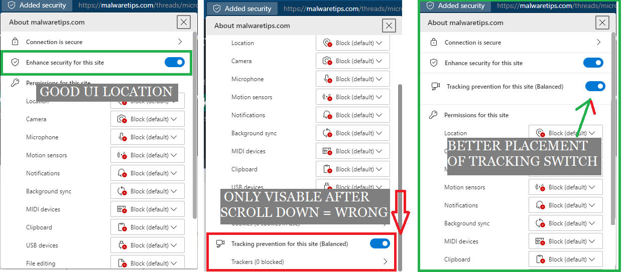
The new extra security switch is on the right place, but the old tracking protection is not visible when clicking on the AddedSecurity Icon, please provide Microft feedback about the wrong placement. Use the feedback button and let's get some attention to M$

@Mods, please DON't reduce this image to a tiny non readable picture, a picture explains more than 1000 words
1644154345421.png
 
Question to @Jack What is the use of sharing setup tips with pictures when mods make these pictures so small they become useless (lose all info)
I've never seen this happen before, you've uploaded a full-size image right? Look at @oldschool upload in the same thread, it looks fine. I'll look into this.
 
It's me who usually edit some posts, with BIG pictures, and change them to thumbnails, the original picture size is not changed, to get it just click over the thumbnail... I often do this thinking of mobile users, sometimes also I add SPOILERs, for the same reason.
 
Last edited:
This message sent with screenshot:
Subject: UI change for new "Added security" flyout.
Suggested solution: Please change the "Added security" flyout to show "Tracking prevention for this site" immediately underneath "Enhance security for this site" followed by "Permissions for this site".
Problem with current UI: Users must scroll all the way to the bottom to view "Tracking prevention for this site" when strict permissions are set globally with many block settings.
 

You may also like...