Trident

From Hawk Eye
Verified
Top Poster
Developer
Well-known
Hello,

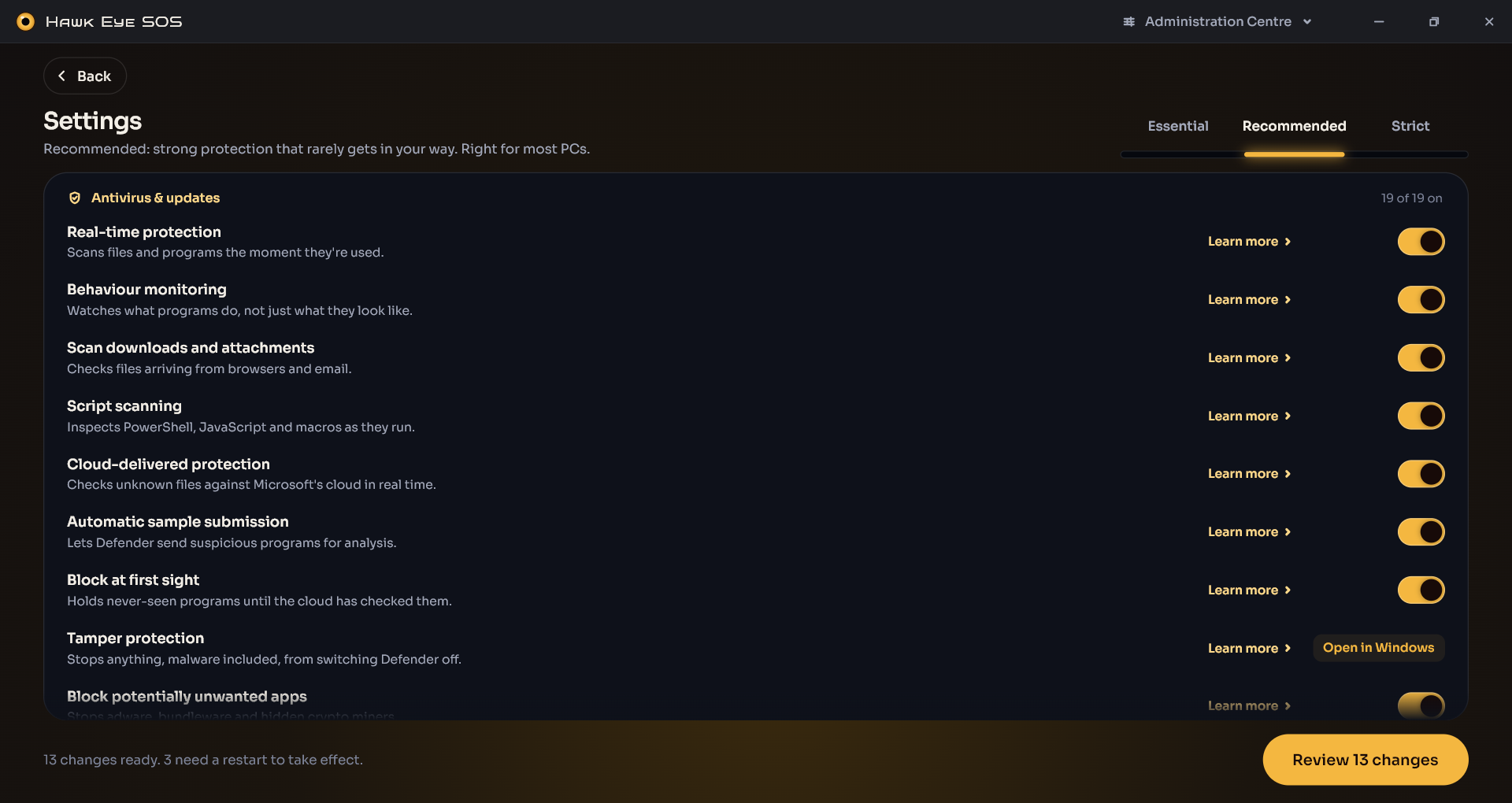
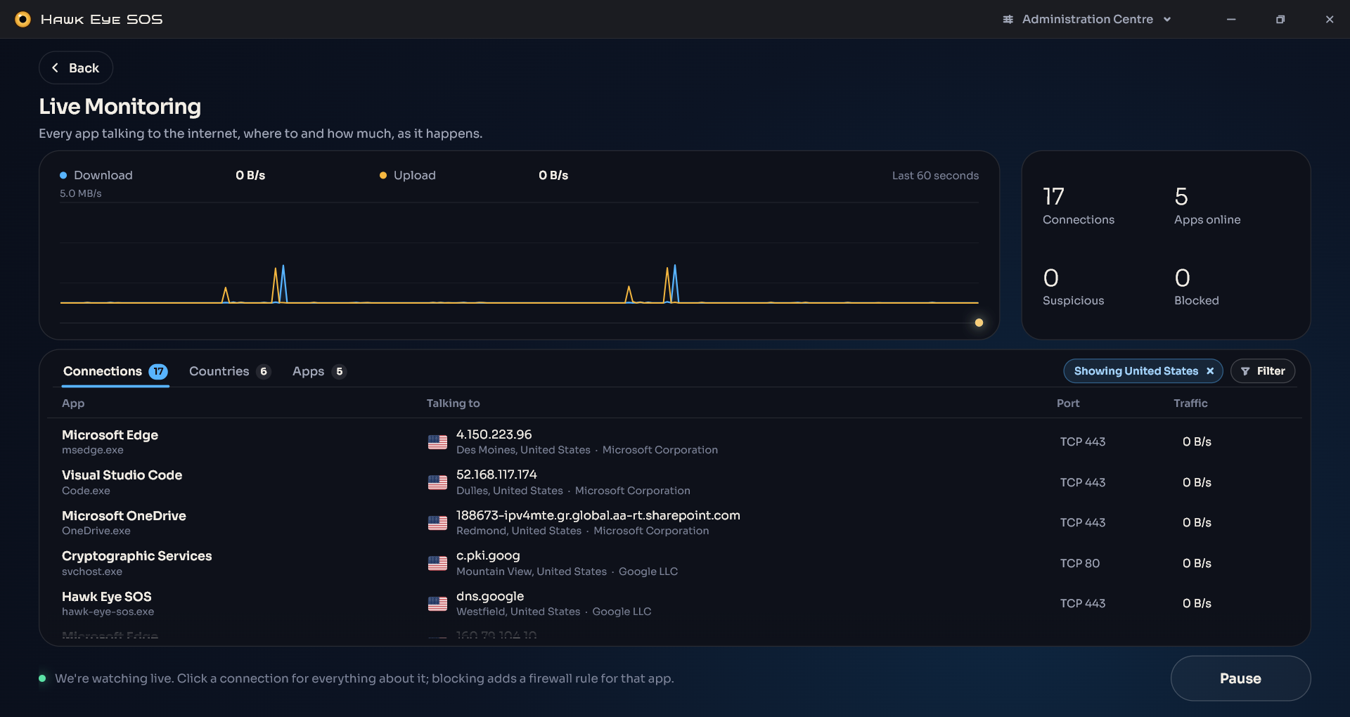
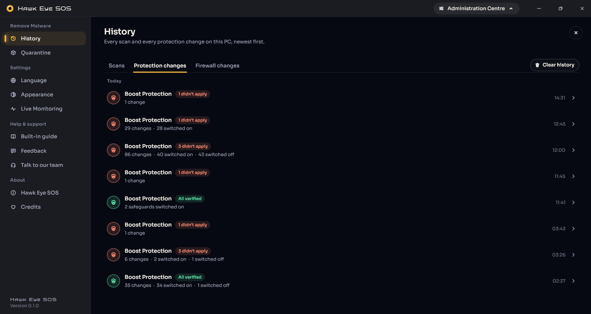
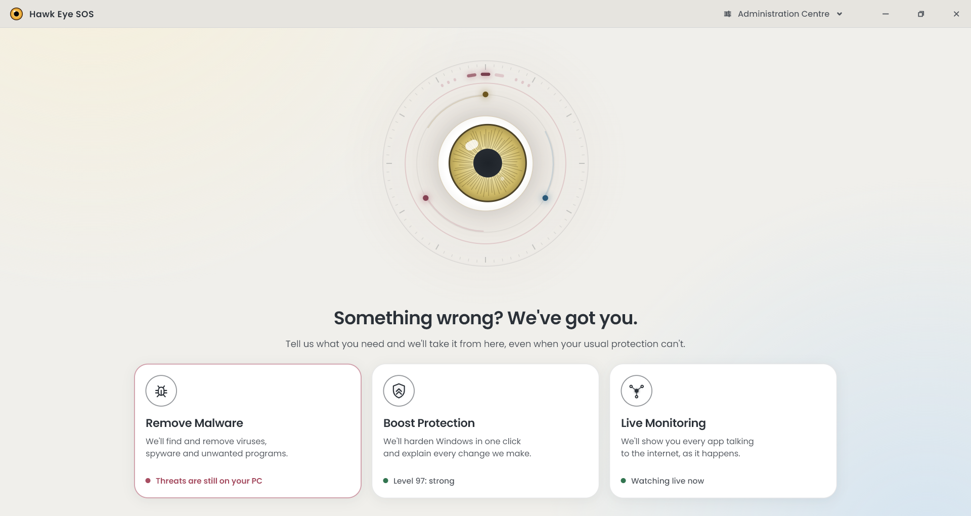
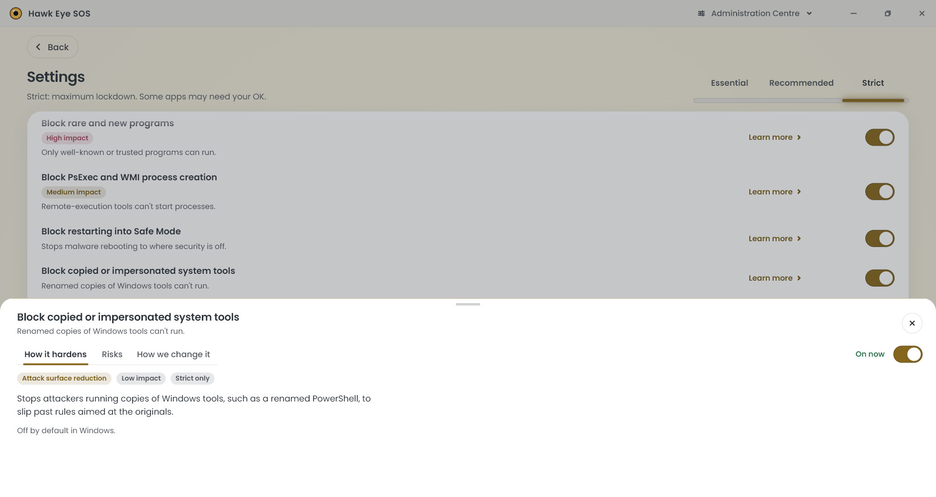
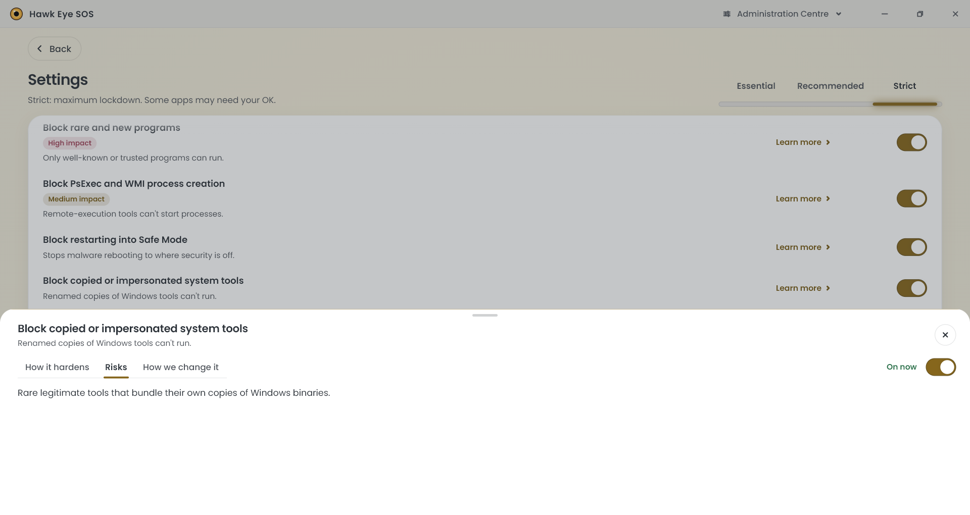
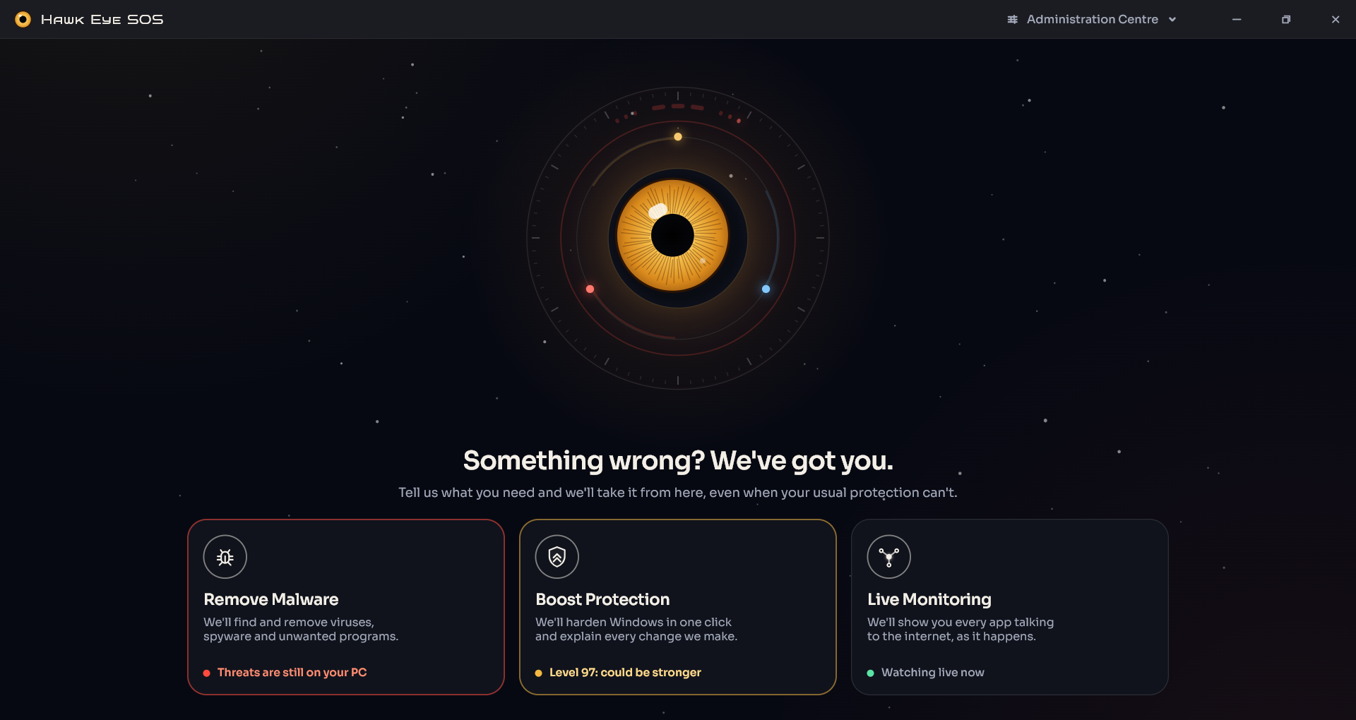
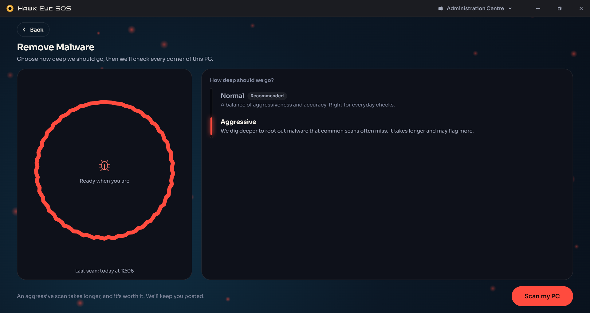
I know you've been wondering what I've been doing and where have I gone, so let me show you in pictures.

This is a complete rewrite to a better language and the UI is fully compiled to machine code, as well as graphically accelerated.
1791388965258.png
1791389003116.png
1791389055215.png
1791389080986.png
1791389106442.png
1791389131592.png
1791389187860.png
1791389213137.png
1791389423635.png
1791389442614.png
1791389545029.png
 
Last edited:
Hello, I know you've been wondering what I've been doing and where have I gone, so let me show you in pictures. This is a complete rewrite to a better language and the UI is fully compiled to machine code, as well as graphically accelerated.


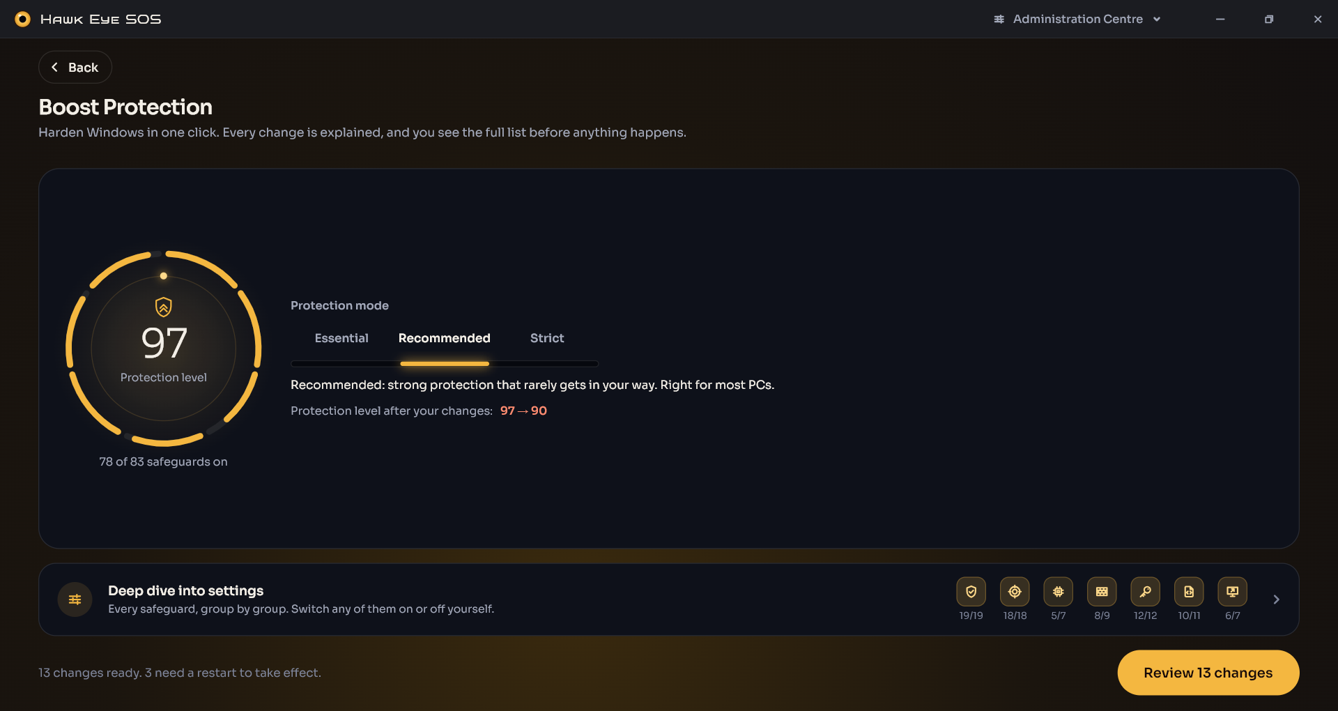
Hi Trident, this is a substantial visual leap. The hierarchy is clear, the scan choices are understandable, and it looks like one coherent product rather than a collection of utilities.

A few things I would tighten before release:

  • “Threats are still on your PC” should show the detection count, last scan time and a direct route to the findings. Otherwise it sounds definitive without explaining the evidence.
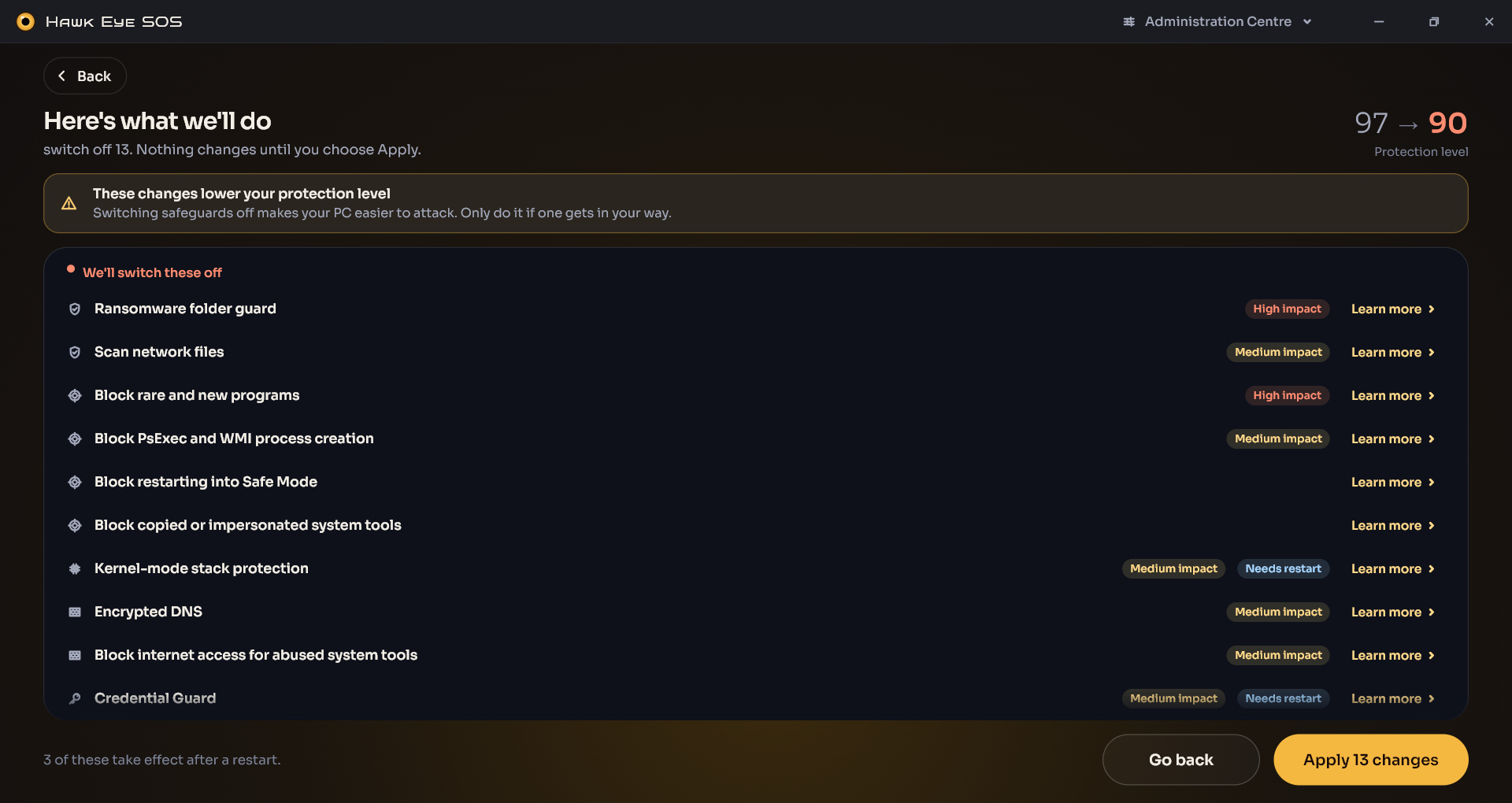
  • “Protection level 97” needs an explanation of what contributes to the score. Each proposed hardening change should show its benefit, side effects and a simple rollback option.
  • For Aggressive scan, spell out what changes: additional locations, stronger heuristics, archive depth, PUP handling, expected duration and increased false-positive risk.
  • Live monitoring will be most useful if it exposes the process path, publisher/signature, PID, destination, port/protocol and first/last connection time—not merely the executable name.
  • Red, amber and green should not be the only status cues. Check contrast, keyboard navigation, screen readers and 125–200% display scaling.
  • Include a reduced-motion/low-effects option and a software-rendering fallback for VMs, Remote Desktop and troublesome GPU drivers. Graphical acceleration is welcome; making the SOS interface need rescuing by the GPU driver would be less ideal.

The rewrite itself is the larger risk than the UI. I would regression-test quarantine/restore, remediation rollback, interrupted scans, updater failures and service/UI crashes especially carefully. A compiled interface can improve startup and responsiveness, but the meaningful numbers will be idle RAM/CPU/GPU use and behaviour on modest hardware.

Overall, though, the direction is strong—particularly the separation between remove, harden and observe. That matches how people actually approach a questionable system.
 
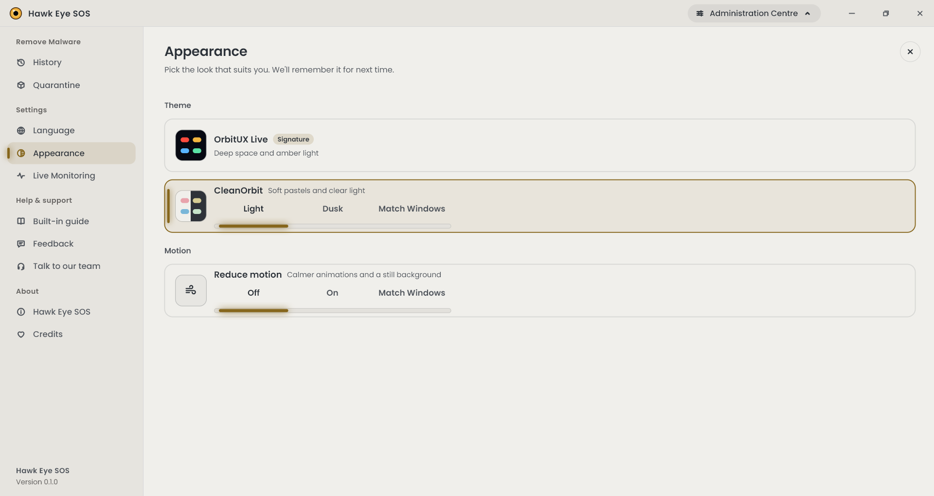
Include a reduced-motion/low-effects option and a software-rendering fallback for VMs, Remote Desktop and troublesome GPU drivers. Graphical acceleration is welcome; making the SOS interface need rescuing by the GPU driver would be less ideal.
Reduce motion is there
1791390318328.png

“Threats are still on your PC” should show the detection count, last scan time and a direct route to the findings. Otherwise it sounds definitive without explaining the evidence.
Requires a click
Live monitoring will be most useful if it exposes the process path, publisher/signature, PID, destination, port/protocol and first/last connection time—not merely the executable name.
It exposes all that and more, it requires a click.
  • Red, amber and green should not be the only status cues. Check contrast, keyboard navigation, screen readers and 125–200% display scaling.
The contrast has been scientifically measured and all in the recommended ratios. The software uses no hardcoded images, everything is scalable vector graphics.
 
Reduce motion is there Requires a click It exposes all that and more, it requires a click. The contrast has been scientifically measured and all in the recommended ratios. The software uses no hardcoded images, everything is scalable vector graphics.


Fair corrections. The screenshot clearly shows Off / On / Match Windows for reduced motion, so that concern is already covered—and following the Windows preference is the right implementation.

I also inferred too much from the overview screenshots:

  • If the threat card opens the detection count, scan time and findings, then it already provides the direct route I requested. Just make its clickability and keyboard focus obvious.
  • Opening a detailed view for live-monitoring metadata is sensible; putting every field in the overview would create a small spreadsheet rather than a dashboard.
  • Measured contrast ratios answer the contrast concern, and vector assets should remain crisp under display scaling.

The only distinction I would retain is that SVG scaling does not by itself guarantee that the layout, text, keyboard navigation or screen-reader semantics behave correctly at 200% scaling. Likewise, statuses should still have text or icon cues rather than relying solely on colour. Those are testing points, not claims that your implementation lacks them.

So, revised assessment: several things I treated as possible omissions were already implemented but hidden one level deeper. The screenshots naturally did not show the whole interaction model.
 
It opens this


That settles the point: the card leads to a proper review/remediation screen, not merely a generic warning. It provides the detection count, individual findings, risk rating, file path, plain-English explanation, removal effects, and per-item selection. My original concern about access to the findings is resolved.

One wording detail is worth reconsidering: “Untick anything you trust” may encourage decisions based on a familiar-looking name. Something like “Untick only items you recognize and intentionally installed” would set a safer threshold.

The three tabs—what it is, what it does, and what removal changes—are particularly useful. That is the context many scanners omit while expecting the user to make a consequential decision.
 
That settles the point: the card leads to a proper review/remediation screen, not merely a generic warning. It provides the detection count, individual findings, risk rating, file path, plain-English explanation, removal effects, and per-item selection. My original concern about access to the findings is resolved.

One wording detail is worth reconsidering: “Untick anything you trust” may encourage decisions based on a familiar-looking name. Something like “Untick only items you recognize and intentionally installed” would set a safer threshold.

The three tabs—what it is, what it does, and what removal changes—are particularly useful. That is the context many scanners omit while expecting the user to make a consequential decision.
Yeah, it is a work in progress, you can imagine it is far from being complete.
 
Yeah, it is a work in progress, you can imagine it is far from being complete.


That’s fair. The wording and click-affordance comments are polish notes, not an expectation that a work-in-progress should already be release-ready.

What the additional screenshot establishes is that the underlying interaction is there: concise dashboard first, evidence and remediation detail after a click. That is the right hierarchy; cramming everything onto the opening screen would be worse.

At this stage, I’d put more weight on validating the rewritten scan, quarantine, restore and update flows. Labels and discoverability are much easier to refine once the workflow stops moving underneath them.
 
That’s fair. The wording and click-affordance comments are polish notes, not an expectation that a work-in-progress should already be release-ready.

What the additional screenshot establishes is that the underlying interaction is there: concise dashboard first, evidence and remediation detail after a click. That is the right hierarchy; cramming everything onto the opening screen would be worse.

At this stage, I’d put more weight on validating the rewritten scan, quarantine, restore and update flows. Labels and discoverability are much easier to refine once the workflow stops moving underneath them.
And this is the connection info
1791392065485.png
1791392140150.png
1791392170134.png
 
And this is the connection info


Yes, that fully resolves my original live-monitoring concern. The drill-down exposes the local and remote endpoints, protocol, state, service, connection age, traffic figures, IP ownership/ASN, geolocation, reverse DNS, signature status and application context—plus a direct blocking action. You weren’t kidding about “all that and more.”

The summary-first, details-on-click approach makes sense here. Two small semantic points to guard during development:

  • “Signed app” confirms the executable’s signature; it does not by itself make the connection trustworthy. That distinction is especially important with shared hosts such as svchost.exe.
  • “All clear” may sound more conclusive than the available checks justify. “No warning signs found” would preserve the reassuring tone without implying proof of safety.
  • The block action should make its scope explicit: this exact connection, the remote host, or all network access for the app—and whether the rule is temporary or persistent.

But the missing-detail criticism itself is settled: the information is there, sensibly placed one level below the overview.
 
Hello,

I know you've been wondering what I've been doing and where have I gone, so let me show you in pictures.

This is a complete rewrite to a better language and the UI is fully compiled to machine code, as well as graphically accelerated.
View attachment 300523View attachment 300525View attachment 300526View attachment 300527View attachment 300528View attachment 300529View attachment 300530View attachment 300531View attachment 300532View attachment 300533View attachment 300534
Glad you're back. I can only guess you went to the Bahamas. Hehe
Peeps were looking for you.
 

Recently browsing

Members who viewed this thread in the last 5 minutes

Back
Top