I like them all, I do love the dark, then the beta and the current default last, but they're all very pleasing 
MalwareTips 2.0 Theme (Feedback and Testing for Members)
- Thread starter Jack
- Start date
You are using an out of date browser. It may not display this or other websites correctly.
You should upgrade or use an alternative browser.
You should upgrade or use an alternative browser.
- Status
- Not open for further replies.
Great to have these options but like a few others have said I'm used to the "old"-default theme!
Call me boring but....
PS:I would like to say that the new icons do look great!!
Call me boring but....
PS:I would like to say that the new icons do look great!!
Tried it on, very attractive theme. Nice work !
I still can't part with the dark theme though
PS: Those flashing online indicators sure would look nice in the dark theme I bet.
I still can't part with the dark theme though
PS: Those flashing online indicators sure would look nice in the dark theme I bet.
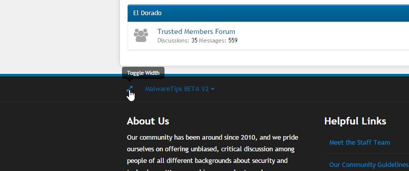
One new feature that might go overlooked is the "Toggle Width" button, which is pretty nice if you are using a large screen. Give it a try.

H
hjlbx
Well done to the MT team this new style looks way cool. 
Aww man, I spread the theme and I think i'm hooked, Damn you Jack lol 
Thanks.Well done to the MT team this new style looks way cool.
It does have a lot more features that makes it easier to use. Like I've said, I like it because easier to use while on a mobile device.
: DAww man, I spread the theme and I think i'm hooked, Damn you Jack lol
I prefer the greyish background instead of white. Other than that, UI is lighter and can save mobile data.
It is better than the standard theme however I prefer the dark theme only. Bright themes hurt my eyes so I can not use them. Would be cool to have the dark theme look like the new theme but just... you know dark. Sure you can invert colors or use other methods to make a bright theme dark but it doesn't look as good.
At the least, I hope the dark theme will stay.
At the least, I hope the dark theme will stay.
Agreed, dark themes are always welcome. I'd rather not be blinded by bright skins when it turns dark over here.
It is better than the standard theme however I prefer the dark theme only. Bright themes hurt my eyes so I can not use them. Would be cool to have the dark theme look like the new theme but just... you know dark. Sure you can invert colors or use other methods to make a bright theme dark but it doesn't look as good.
At the least, I hope the dark theme will stay.
The dark theme will stay, and I know that are a lot of users who like the darker layout. Thanks for the feedback.Agreed, dark themes are always welcome. I'd rather not be blinded by bright skins when it turns dark over here.
It looks good, but there are few things that I don't like:
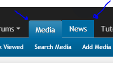
The tabs at the top of the page. An active tab has round borders, when you hover over a tab, the borders are not round. Also when hovering over a tab with a dropdown (like the media tab), the borders switch from a rectangle border to a round border.

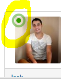
Also is there any way to turn the blinking online status off? It's a nice feature, but it is a bit annoying and distracting when I am reading posts, but that's my opinon of course

Apart from that, it looks great!
The tabs at the top of the page. An active tab has round borders, when you hover over a tab, the borders are not round. Also when hovering over a tab with a dropdown (like the media tab), the borders switch from a rectangle border to a round border.
Also is there any way to turn the blinking online status off? It's a nice feature, but it is a bit annoying and distracting when I am reading posts, but that's my opinon of course
Apart from that, it looks great!
The border is now round.It looks good, but there are few things that I don't like:
The tabs at the top of the page. An active tab has round borders, when you hover over a tab, the borders are not round. Also when hovering over a tab with a dropdown (like the media tab), the borders switch from a rectangle border to a round border.
Apart from that, it looks great!
@Jack i like the new theme it's a combination between the default and the dark theme.
The new theme is more pleasant for the eye in comparison with the default.
I also like the dark theme but there i have 2 minor issues.
First one is that it;s a bit difficult to read the quoted messages in the post's because the letters aren't so bright.
And the second is that in the dark theme i can't see if a member is online ( maybe i missed that ).
Voted the new beta theme but i must say that probably i will be switching between themes from now on
The animation was cool, I'm not sure how it's distracting and barely noticeable to be annoying.It's a nice feature, but it is a bit annoying and distracting when I am reading posts, but that's my opinon of course
It's cool to see it moving now, but I just prefer non moving things om my screen when I am reading text.The animation was cool, I'm not sure how it's distracting and barely noticeable to be annoying.
Will there be a dark version of the new beta theme?
- Status
- Not open for further replies.
You may also like...
-
SOpera updates with a redesigned History, new Themes, and an experimental feature
- Started by Santiago Benavides García
- Replies: 9
-
SOpera One R3 arrives with new AI, Google integrations, and more
- Started by Santiago Benavides García
- Replies: 0
-
SOpera presents Early Bird mode in Opera One to test upcoming features
- Started by Santiago Benavides García
- Replies: 0
-
APreviewing More Copilot+ Experiences with Windows Insiders in the Dev Channel
- Started by Amanda Langowski
- Replies: 0
-
ABeginning to enable a set of new features for Windows Insiders in the Dev Channel on Build 26120.961
- Started by Amanda Langowski
- Replies: 0