By Staff Site Issues and Feedback

The modal with reactions is better off frozen, as well as content behind, when transitioning to a new state (reading the modal) should freeze. The modal can have
overflow-y: auto; property so that scrollbar appears in the modal when it’s needed.

I usually treat modals as sacred. When they appear, nothing else matters.
what's a modal (in this forum context :unsure: )
 
what's a modal (in this forum context :unsure: )
Modal is a dialogue/popup/window that appears in a web page/web app on top of the other content. Like when you click to see who likes your posts.

1757955298275.png
 
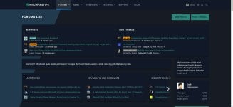
The dark version uses odd colors. Blues and green and opposed to black and gray for a dark version? The non-dark version is darker than the "dark" version. Ummm...what? Why? Did I wrong @Jack in a previous life?
 
@Jack The new design is not bad but I use Edge with its dark mode flag with the option, "selective inversion of non-image elements". But with this, the already darker top area looks even darker and makes the message, notification and search icon fairly invisible. Not sure if you can do something about it.
1757959086456.png
1757959132865.png
The NEW POSTS, POST THREADS buttons also look bigger than before. My 768p monitor is one reason, another reason is probably because of the yellow-colored background they are more eye-catching than they used to.
 
I really like this site and community. But there are big problems with the administration's feedback. I once wrote to support when, for some reason, I couldn't register, and later couldn't access the forum. Unfortunately, in both cases, I didn't receive any response. I think the administration has some work to do in this area to make the site and forum even better and attract more new users. :)
 
Last edited:
@Jack,
Is there any chance we can have the old light theme as an option as well?
Using the old light theme, I created 35 filter rules in uBlock Origin to filter all forum elements that were tiresome or annoying to me. I like it simple and tidy.
With the new light theme, some elements that I filtered are now back. I would need to redo my filter rules, very annoying. I would very much like to use the old light theme so I can have it simple and tidy again, without redoing my filter rules.
Thanks very much.
 
@Jack The new design is not bad but I use Edge with its dark mode flag with the option, "selective inversion of non-image elements". But with this, the already darker top area looks even darker and makes the message, notification and search icon fairly invisible. Not sure if you can do something about it.
The NEW POSTS, POST THREADS buttons also look bigger than before. My 768p monitor is one reason, another reason is probably because of the yellow-colored background they are more eye-catching than they used to.
I have discovered the notifications icon by the light at the end of the tunnel.
2025-09-15 19.41.36 malwaretips.com 1356bf2880a3.jpg