Last edited:
By Staff The New Light and Dark Themes
- Thread starter Jack
- Start date
You are using an out of date browser. It may not display this or other websites correctly.
You should upgrade or use an alternative browser.
You should upgrade or use an alternative browser.

Love the new dark theme however this header takes way too much space.

Unless one perhaps tries to make the brighter dark field in parts ( left and right ) blend/mix better into the above and below. Similar the light theme has now. That effect makes the size look less obvious.Love the new dark theme however this header takes way too much space.
The dark theme looks good, though my personal preference has to be the old version. I'm stubborn like that, plus I prefer dark grays over flat black (or close too).
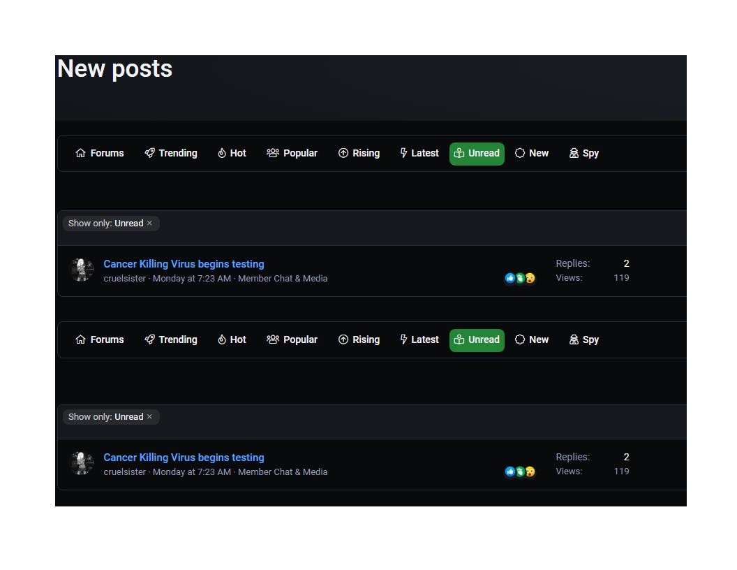
Like the dark theme, but yesterday started noticing that when 'unread items' are selected it displays the full list twice. If I switch to the light theme then they're displayed once, but switching back shows the list twice again. Running Windows 11 and Chrome both with latest updates. Strange...
Last edited:
L
Local Host
Still think the frontpage looks better clean,Love the new dark theme however this header takes way too much space.
View attachment 266942
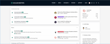
Oh boy, this new dark theme is much more readable on my monitor. Thanks @Jack !
darker the better..... i hate having to squint at bright apps/sites, liking the new even darker theme!
Maybe its my eyes, maybe my glasses but in dark theme the text is a bit blurry for me.
I also noticed that, but like you I also thought it was just me and my eyes.Maybe its my eyes, maybe my glasses but in dark theme the text is a bit blurry for me.
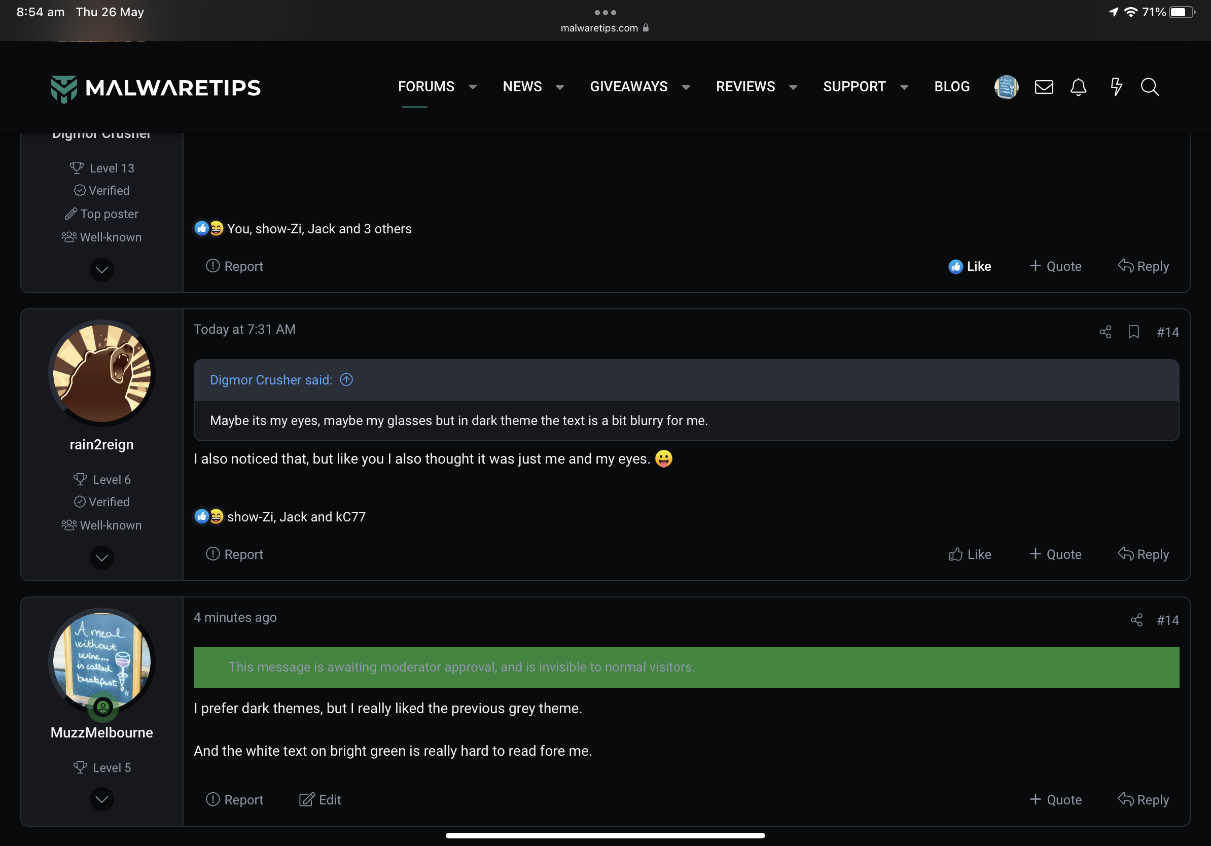
I prefer dark themes, but I really liked the previous grey theme.
And the white text on bright green is really hard to read for me.
And the white text on bright green is really hard to read for me.
Last edited:
I like dark theme designs and tones, but when using a glossy display, the dark theme is always face-to-face with my reflected face, which can be very distracting.
That's why I choose the light theme.
Dark themes are overwhelmingly more recognizable for changes in the text display of links. This is enviable.
That's why I choose the light theme.
Dark themes are overwhelmingly more recognizable for changes in the text display of links. This is enviable.
I only use the black theme, the white kills my eyes. 
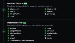
I liked the green color, it looks very stylish with the black, good job @Jack!
I liked the green color, it looks very stylish with the black, good job @Jack!

Last edited:
F
ForgottenSeer 77194
I like the new design. But I suggest in dark theme, the symbols and texts such as like, quote, last edited and profile information to be "whiter" or "brighter". They grey color of the text is "similar" to the dark background making it difficult to distinguish and read.
You may also like...
-
SOpera Listens: Introducing New Community-Inspired Themes to Opera One
- Started by Santiago Benavides García
- Replies: 0
-
SOpera updates with a redesigned History, new Themes, and an experimental feature
- Started by Santiago Benavides García
- Replies: 9
-
New Update Excel-lent news: Excel finally gets proper dark mode with dark cells
- Started by Gandalf_The_Grey
- Replies: 0
-
Technology Microsoft celebrates 11 years of Windows Insider Program with new wallpapers
- Started by Gandalf_The_Grey
- Replies: 2
-
New Update Here are the new features in macOS Tahoe 26
- Started by lokamoka820
- Replies: 2


