Windows UI - We have got to go back

Status
Not open for further replies.

JakeXPMan

Level 17
Verified
Top Poster
Well-known
Oct 20, 2014
804
I like different things from each Windows, I quite like the look of Windows 7 and 10, XP etc, but I voted for 7's UI as a whole, and yeah the glassy Aero is my favorite and looks most modern IMO. Windows 10 looks older then Windows Vista, apart from the "Start Up" screen, which has a very appealing touch screen look and mixed with its traditional flare so its not weird like Windows 8.

My problem is the ugly empty looking icons in W10, and a lot of paths to do the same things, I can't even find the control panel and the folders have so much clutter of options, I click myself into a labyrinth leading to dead ends, and start over, wait where is the updates downloading at?

I like Windows 10, it could have been way worse... but some of its functions are too overkill and overdone to me. The font is a bit blurry the Icons look like retro re-imagined, with a pastel one color minimalist. I hope its saving resourses by doing so, because appearance is bland.

I'm staying on Windows 7, at least for now. I dont use all the features that 10 has. I don't own a tablet or use extra stuff like Cortana. Of course they have ways to turn these extras off.

On a side note,
I don't like how software copies almost always adapt Windows 8+'s look and style. (I blame Windows 8's appearance not functions) I miss the originality of colorful Icons and designs from my fav programs, pre 2013.
iu


I find newer looks more dated, blocky and single color squares.
iu
 
Last edited:

Antimalware18

Level 10
Thread author
Verified
Well-known
Jan 17, 2014
487
You know what would be a cool and innovative idea guys? (Microsoft won't)

Is that under what them you want they added back all the past windows themes so everyone could be happy lol

that way I wouldn't have to download programs to emulate vista :devil:

a%3E

otw9xao.jpg


a>
 

Prorootect

Level 69
Verified
Nov 5, 2011
5,855
MS designed win8/10 for their Windows Mobile UI and touchscreens, the WinXP/7 design isn't adapted for such devices.
I tried Win7 on a touchscreen device; it was horrible experience, Win7's start menu was unfit for such task.
Windows now isn't just for desktop PCs, it is for all kind of devices, MS put lot of resources on their Surface machines so the actual "flat"design is perfect for it.

There is no debate on it. Especially about design, which is just matter of taste and opinion; for 1000 people liking it, you will have 1000 others disliking it.
Something that was made for many different things at the same time, is not a good idea!
Because this will never be perfect for every application! There will always be dissatisfied users from each side, and unfortunately each of them will be right. It is not possible to grasp several magpies at the same time on their tails.....my favorite saying. "You can't put two saddles on one horse." ... "He who runs after two hares will catch neither"...Don't try to do two things at a time.
three magpies - linternaute.com.jpgthree magpies - linternaute.com.jpg

Curious Cat Meets Some Curious Birds


The cat left with no catches, Microsoft.

Deafblindness of Microsoft and contemporary designers is worthy of being flooded.
In salt water, why not.
- so progress, progress on the good road, right track, Microsoft.
"The best road to progress is freedom's road." - John F. Kennedy
 
Last edited:

Prorootect

Level 69
Verified
Nov 5, 2011
5,855
Antimalware18 wrote:
"You know what would be a cool and innovative idea guys? (Microsoft won't)
Is that under what them you want they added back all the past windows themes so everyone could be happy lol
that way I wouldn't have to download programs to emulate vista :devil: "

- Yes sure I'm with your idea!

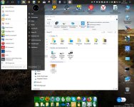
You have very nice desktop. But first image are not here?
 
D

Deleted member 65228

Speaking of Windows 10 though, I can talk about changes in the generation and modern world forever but there is still one massive flaw with the Windows 10 design... Bloatware.

I like the Windows 10 UI components, I like the Start menu, task bar, I also like the icons. But one thing I cannot stand is the bloatware which comes with Windows 10 Home, Professional and Enterprise by default (and is enabled) which a lot of users likely do not actually need. Because of such, there are more attack vectors for an attacker to investigate and exploit, compromising security.

If you look at Windows 7, it was a lot more lightweight than Windows 10. It had a lighter feel to it. This is because it genuinely was lighter, it wasn't a placebo effect. There was a whole lot less running in the background using up your resources back on Windows 7, and it all changed with Windows 8. Of course, new functionality means more resources are used, but I'm not talking about general improvements to the Windows Kernel, and general new software which is useful and necessary. I'm talking about all the trash that comes installed by default and/or is active at the same time.

Look at all these Metro applications like the Mail, Calendar, Windows Store, etc. I will never ever use them, it should have been my choice to have them installed, instead of them using up disk space. I don't care if it is 1MB or 2MB, disk space is disk space. It just is not acceptable.

If Windows 10 cut the bloatware then it would be a lot easier to use for novice users (and also experienced) and would be more appropriate in terms of performance I'd say.
 

Prorootect

Level 69
Verified
Nov 5, 2011
5,855
Speaking of Windows 10 though, I can talk about changes in the generation and modern world forever but there is still one massive flaw with the Windows 10 design... Bloatware.

I like the Windows 10 UI components, I like the Start menu, task bar, I also like the icons. But one thing I cannot stand is the bloatware which comes with Windows 10 Home, Professional and Enterprise by default (and is enabled) which a lot of users likely do not actually need. Because of such, there are more attack vectors for an attacker to investigate and exploit, compromising security.

If you look at Windows 7, it was a lot more lightweight than Windows 10. It had a lighter feel to it. This is because it genuinely was lighter, it wasn't a placebo effect. There was a whole lot less running in the background using up your resources back on Windows 7, and it all changed with Windows 8. Of course, new functionality means more resources are used, but I'm not talking about general improvements to the Windows Kernel, and general new software which is useful and necessary. I'm talking about all the trash that comes installed by default and/or is active at the same time.

Look at all these Metro applications like the Mail, Calendar, Windows Store, etc. I will never ever use them, it should have been my choice to have them installed, instead of them using up disk space. I don't care if it is 1MB or 2MB, disk space is disk space. It just is not acceptable.

If Windows 10 cut the bloatware then it would be a lot easier to use for novice users (and also experienced) and would be more appropriate in terms of performance I'd say.
So you wrote: "it should have been my choice ..." - very true, "NO" for bloatware too.

Deafblindness of Microsoft and contemporary designers is worthy of being flooded.
In salt water, why not.
- so progress, progress on the good road, right track, Microsoft.
"The best road to progress is freedom's road." - John F. Kennedy
 
P

plat1098

Windows 10 features terrible UI inconsistency

Yes, this baffles me, all these haphazard fragments and pieces. Out of the box, it's really ugly and poorly configured for universal ease of use.

You can't just "go back". The entire world is constantly surrounded by new smart phones and computer systems, the term here is "ubiquitous computing"

I really like this post, it's very illuminating, esp. Avast's attempts to be "cool" and relevant. :) The thing is, why not go back, as much as you can? It is YOUR desktop. I remember when Windows 10 first came out, people around here were still using the grim default blue wallpaper weeks afterward. Beefing about the obscurity of certain necessities like Control Panel, then hiding it all because it's yech to me. It's my desktop. And it bears no resemblence to Windows on the surface. But it is, most definitely. There was no option for my vote "No." Period.
 

Deletedmessiah

Level 25
Verified
Top Poster
Content Creator
Well-known
Jan 16, 2017
1,469
I dislike them all. Older UI were consistent but feels too outdated now. 10's UI is modern but inconsistent right now. It is not mature enough. Flat UI is a bit bland for me, this includes iOS and Android too. Unfortunately when I go back to older UI, like to Kitkat from Nougat, kitkat feels outdated and this is even worse between Windows 10 and 7/8.1.
 
T

TrinitronMSDOS

So first of all i just want to say that i understand there is no "best UI" when it comes to Windows, same as there are no best AV, and that it depends on the user's use and taste. So what i'm about to say is just my personal opinion based on my personal experience.

First i totally understand you and you're far from being alone. In the 90's, UIs where kind of "boring". Windows 95, 98 and Millennium where almost looking the same. Also back then all UIs had a square design with no (or very few) round borders. At that time i was pleased with that as that was the only UIs available and i never gave much thoughts into it.

Then came Windows XP in the 2000's, and probably what is the best Windows in my opinion along with Windows 7. XP had an amazing look for that time, with lots of round corners, joyful colors (without being childish) and was light on the system as it didn't had effects such as Aero. And not only Windows but most OSs followed that trend. At that time, i though the future of UIs would be soft corners, better effects and such. I would never have thought in the 00's that any company would bring back a square design UI as for me it was a thing of the past.

Then came Windows 8. Oh boy, probably the worst Windows along with Vista in my opinion. That OS will stay in my mind as probably one of the biggest fail of all time when it comes to user interface. I mean, how could you make it any worst ? To access the desktop you had to click on a "tile", as if it was an app. No more start menu with nothing that was really replacing it. And of course back to the pure squared windows, with zero 3D design and zero effects such as Aero... I know i'm bashing that OS big time, but Windows 8 felt like Windows 98 stripped out of his start menu and with a lame full screen app menu on the top. And i'm not even talking about Windows 8.1 and their "incredible" start button.

When it comes to Windows 10, i'm honestly used to it and it is "technically" the best Windows. It's incredibly light, has excellent out of the box protection, has very good self maintenance tools, good native apps, provides access to the app store catalogue while still relying mostyl traditional softwares, syncs your settings, etc... And what makes Windows 10 great is that, unlike previous Windows, Microsoft is constantly adding functionalities and improving it. And i have to agree that even though the UI is very minimalist, it is very clear and straight to the point. So i'm really used to Windows 10 as of now and like it.

But i can't help having mixed feelings about Windows 10 and today's UIs:
- on one hand I like how practical and easy to use is the Windows 10 UI. And it's true that OSs nowadays do offer very optimized UI that have been polished and improved over the years. So much so that i doubt we will see a big change any time soon, regardless if it is on Windows, Android, iOS, etc...
- on the other hand i do miss the extra Aero design and the fact that any kind of design or fun has been stripped out of the UI. And why do these Windows have absolutely no rounded edges ? Probably because it is "optimum", but i can't help but feel it's a step backward.

But i guess the UI of Windows 10 represents the state of today's society when it comes to technologies. There is little place for the "fun factor" nowadays and it is all about being optimized and practical. Take smartphones for example. They are designed to have the biggest screen and most features in the smallest body. Are they useful and the best for everyday use ? Yes. But are they fun or unique ? Nope, they look just like clones regardless of the model or brand. While mobiles phones in the 2000's where all about having polyphonic ringtones, interchangeable cases, unique designs, fun accessories and such.

For better or worse, from software's UI to our daily tech, we are heading to a more optimized and practical future at the cost of losing originality, fun and uniqueness.

Here are some pictures to illustrate the today's practical but bland VS the old unique but less convenient i was talking about:

Windows 10:
Windows-10.jpg


Windows XP:
cmwindowsxpjul15j.jpg


iPhone 8:
u_10168678.jpg


Nokia 3650:
VOK49c109_003_Nokia_3650.jpg
 
Last edited by a moderator:
D

Deleted member 65228

And why do these Windows have absolutely no rounded edges ?
Consistency.

If Windows 10 has flat buttons and tiles here and there but then have a round start menu button (for example) then the design isn't repetitive. Consistency/repetitiveness is typically a factor in UI design to keep things familiar across the platform.
 
T

TrinitronMSDOS

Consistency.

If Windows 10 has flat buttons and tiles here and there but then have a round start menu button (for example) then the design isn't repetitive. Consistency/repetitiveness is typically a factor in UI design to keep things familiar across the platform.

Thanks for the info, i guess that makes sense and i know that you are "technically" right. And as i said i know the Windows 10 UI is indeed very clear, but i can't help but feel that zero 3D, zero effects and zero round edge is a step backward. Where's the fun ? The originality ? The uniqueness ? It is optimized indeed, but it's design is uninspired and bland...

Anyway that's just my opinion ;)
 
D

Deleted member 65228

My opinion has since changed.

I think that Microsoft should cater to different styles and allow the user to decide which one they want, allowing people to have official themes for Windows XP, Windows Vista, Windows 7 with Aero or the modern themes.

It's unrealistic for it to happen but I think it could be good.

To be honest, even though I completely adore Flat UI, I am starting to miss Windows 7 UI despite not using it for years primarily now. I only use it in a VM but it was so much speedier than the Windows 10 UI. Not to mention Windows 7 doesn't have all that bloat junk.

If it wasn't for internal improvements in the Windows 10 Kernel and given that I have to develop for Windows 10, I'd be on a Windows 7 machine. Sadly it would be an insecure choice so I just cannot do that.

C'mon Microsoft, make us all happier. You can't please everyone but you can try. ;)
 

MeltdownEnemy

Level 7
Verified
Well-known
Jan 25, 2018
300
the file finder by group from xp was the best, (for search all photos formats, video formats, all the text documents (pdf, office) in separate groups, etc, in windows 7 they decided to eliminate it. the XP Explorer was the most compact, fast and not occupy the entire screen with repeated things, It could be adapted with your necessities. for me I like to have the maximum space possible to scroll more comfortably in folderlist mode. The classic start menu like windows 95 was the best for look installed programs in the menu program list using the mouse cursor. Things I did not like about Windows 7, the new introduction of the taskbar preview when moving the mouse buttons in the taskbar, it is a hindrance instead of a benefit, too, on the others hands, the crtl+alt+del button combination bringing another options: instead of bringing the task manager to the front, brings the screen lock and close session options, another thing is about the uac because is a hindrance, its slow and silly design. One of the things I hate the most is the change of environment from which I was used to another less manageable, it makes me feel strange and uncomfortable in the new OS ecosystem, it is as if someone cut off one of my arms and remove a lung. luckily there are programs to hide and add things such as classic.shell, 7 + taskbartweaker, oldneewexplorer. the current Windows 10 finished with my patience. is full of bugs and things that will not solve.
 
Status
Not open for further replies.

About us

  • MalwareTips is a community-driven platform providing the latest information and resources on malware and cyber threats. Our team of experienced professionals and passionate volunteers work to keep the internet safe and secure. We provide accurate, up-to-date information and strive to build a strong and supportive community dedicated to cybersecurity.

User Menu

Follow us

Follow us on Facebook or Twitter to know first about the latest cybersecurity incidents and malware threats.

Top