Windows UI - We have got to go back

Status
Not open for further replies.

Antimalware18

Level 10
Thread author
Verified
Well-known
Jan 17, 2014
486
We need to go back on the GUI of windows I mean I personally believe out of all the windows versions I have owned or seen or worked on Windows Vista has got to be the most visually appealing (forgiving all the bugs it had, although I never had a problem)

Now they just trudging foreward and every new GUI they introduce is even more ugly and bland than the last one (windows 8+10 just makes me shudder)

Please dont let me be the only one who feels this way :LOL:

Also is there anyway to tell MS to stop developing sub-par GUI's??

Sure, functionality is more important than looking good. But for the sake of argument isn't it about time we have can have our proverbial cake and eat it to?
 

Prorootect

Level 69
Verified
Nov 5, 2011
5,855
Flat design sucks. Windows 10 GUI design sucks. Tiles sucks.


They all seem to be jumping on this trend like a bunch of self-conscious teens.
I really frackin’ hate it.
This isn’t high school and the world isn’t flat. Stop it.
flatlogossuck.jpg


- from tweakhound.com: The Flat Logo Society - TweakHound
...and MT topic:The Flat Logos SUCKS! Google, Microsoft ..: The Flat Logos SUCKS! Google, Microsoft ..

Sadder times are coming .. Less colors, all are flattened, with no life ..

From a technical point of view: Why Windows 10 Sucks or Everything Wrong with Microsoft Windows: on altervista.org: Why Windows 10 sucks or Everything Wrong with Microsoft Windows
Yes Microsoft has lost its mind...
- quote:


    • Windows 10 features terrible UI inconsistency, not limited to:
      • Two kinds of font antialiasing (ClearType v2 for classic applications and some awful dirty grayish something for Modern apps). Truth to be told it's not a problem with HiDPI monitors but few people own them.
      • All kinds of varying visual decorations and styles (some people have discovered up to seven varying styles in Windows 10).
      • Absolutely dissimilar classic and modern (PC settings) control panels.
      • Different font faces and sizes all around.
      • Different styles of settings for modern apps.
      • Absolutely different context menus and their appearance in different applications and apps.
    • Terrible hardly-configurable appearance, dubious design choices and extremely limited functionality (vs Windows 7/XP):
      • Two Control Panels with absolutely zero thought given to how they differ and why each one should be used.
      • Some Control Widgets are spread between the two Control Panels which is utterly confusing (e.g. User Management).
      • No Windows classic UI for windows decorations. Windows decorations can hardly be configured at all in Windows 10.
      • An awful choice of colors/palette.
      • Absolutely awful, childish and amateurish icons (the current release features slightly better icons) as if we live in the era of eight-bit displays (only rivalled by those in Windows 3.1 from 1992). Windows 2000 in 1999 looked better than Windows 10 in 2015.
upload_2018-1-5_9-20-37.jpeg

...so Windows devolution picture: https://itvision.altervista.org/files/windows_devolution.jpg

I voted of course for Windows XP design look. Of course.


Prorootect

Level 69
Verified
Nov 5, 2011
5,855
It's easy to find this topic on MT: in the search box, type "flat design sucks" ...
exactly
Antimalware18 - thank you for this thread, cause it's time to get things moving!
But Microsoft maybe doesn't see poll results of this topic, cause poll results are only viewable after voting, - so could you change that, please?..
fondo-con-ombra.jpg
fondo-con-ombra.jpg
Take a look at the pictures in my topic "NEW Stunning Web Pictures Gallery": Off-Topic - NEW Stunning Web Pictures Gallery - yes latest page #26 link here, why not... That way you can see my taste for color. It's true, that each one of you can have a different taste, it's freedom, but...
Tell me what you think of colors - life, I consider it too short not to take full advantage (of natural colors...)... Washed-out life does not interest me (I am not talking about washing machines, it is very useful!).
Ugly flat design of recent Windows, I leave it for the amateurs, lovers of washed out flat colors. Microsoft's design was once great (Windows XP) is now a shell - now it's all washed out, pity.

I don't have a color scale view of a cat, but a human (the cats rather see in fade bland grey, bland green, bland blue...). These are underwater colors, this new design stripping down trend... underwater disease. Monochromaticity, for visually impaired, daltonists (red-green color blindness)....I'm not daltonist, vivid strong colors is my taste. Vivid photos possibility you have in some cameras, I rejoice with it.
Some images and links to you:

Don't burn colours:
Well I think that all lives matter- and all colors matter.jpg

Well I think that all lives matter - and all colors matter.jpg

Now, compare these posters - which one you prefer?:
the-good-the-bad-and-the-ugly-1966_poster AllPosters.com.jpg
...
Minimalist poster design - by Jeremy Burns pinterest.com.jpg

First image: the-good-the-bad-and-the-ugly-1966 poster AllPosters.com.jpg
Second: Minimalist poster design for the Clint Eastwood western The Good, The Bad, and The Ugly - by Jeremy Burns pinterest.com.jpg

Neon Saltwater design - hotel room - IKEA-furniture  plastic plants cityartsmagazine.com.jpg

Neon Saltwater design - hotel room dotted with IKEA-furniture and plastic plants cityartsmagazine.com.jpg
instagram.com/neonsaltwater: N E O N S A L T W A T E R (@neonsaltwater) • Instagram photos and videos - so there are examples of very underwater monochromatic minimalist flat colors in neon light surely I don't like, NOT my taste.
And here you have Neon Salwater deeply underwater design in relation to the vivid color live image of Neon Salwater:
NeonSaltwater_KellyO - cityartsmagazine.com 730x487.jpg

NeonSaltwater_KellyO - cityartsmagazine.com 730x487.jpg


Braeburn_GrannySmith_dichromat Simulation  normal and dichromatic  perception - wikipedia.jpg

Braeburn_GrannySmith_dichromat Simulation of the normal (above) and dichromatic (below) perception of red and green apples - wikipedia.jpg

Our friend Petrovic wrote:
'Minimalism seems to be the trend of the hour, or more precisely, of the past two or three years in the browser world. It started with the release of Google Chrome and its minimalistic design and is still ongoing.'
I responded:
"- SHAME for the design development level reached before that Humanity get this flat plague ..
This browser is hardly engaging. It's almost nothing.
Soon, next version will be .. nothing.
- with this ugly flat trend."
- Here: Yandex releases alpha version of new minimalistic browser

Take a look at these minimalist ugly design images at UGLY DESIGN
The Bane of UI Minimalism: on creativeimpatience.com: The Bane of UI Minimalism
Effective Visual Communication for Graphical User Interfaces by Suzanne Martin: on web.cs.wpi.edu: Designing Effective User Interfaces

See you soon, on the salt waves of flat design compared to the lively image in vivid colors...

EDIT:
Deafblindness of Microsoft and contemporary designers is worthy of being flooded.
In salt water, why not.
- so progress, progress on the good road, right track, Microsoft.
"The best road to progress is freedom's road." - John F. Kennedy
 
Last edited:
D

Deleted member 65228

But Microsoft maybe doesn't see poll results of this topic, cause poll results are only viewable after voting, - so could you change that, please?..
Why would Microsoft check the poll votes? You can have a 1000 votes against Flat UI. Microsoft aren't going to care. They use Flat UI because it's more modern, times have changed. If Microsoft start moving back to the past instead of pushing for the future of next-generation then they will lose customers, which comes with losing money.

Might sound crazy but as hard as it is to believe, if Microsoft went back to a UI like Windows 2000, Windows XP, Windows Vista... People will drop it more. It'll not work for them using a new smart-phone with a trendy style, then using a PC with an OS using an UI from 10 years ago. Or using UI like it is now, then stepping back to older

Would you swap a 2018 Ferrari for a normal car from 2002? That's how it'd feel
 
Last edited by a moderator:

Prorootect

Level 69
Verified
Nov 5, 2011
5,855
Sorry Opcode,
but I'm sad to say that I don't agree with every one of your post above sentences... sorry!
But I like you just the same, don't worry.

Deafblindness of Microsoft and contemporary designers is worthy of being flooded.

In salt water, why not.
 
Last edited:
D

Deleted member 65228

UI is changing so much even nowadays. Look how iOS isn't identical to Windows, they have different icon styles for example. Google have their own style for modern design which still follows the Flat UI trend. But it is all considered modern

Maybe you can find some customisation kit/themes for older versions for Windows 10
 
Last edited by a moderator:
  • Like
Reactions: TrinitronMSDOS

Prorootect

Level 69
Verified
Nov 5, 2011
5,855
I know you don't agree because I can see you dislike flat UI and that's fine but it's in Microsoft's interest to not move backwards. They'll lose money and customers. In 15 years time people of that time aren't going to want a UI which is like it is today, it'll be a lot different the same way it is different now than it was back in 2000-2006 times and alike.

Let's say a business man is operating a software company for 20 years. 7 of those years there might be a general trend, but the target market moves on and now the trend which the customers want is different. So by not changing the UI, they will lose customers and may not introduce new ones of those years.

UI is changing so much even nowadays. Look how iOS isn't identical to Windows, they have different icon styles for example. Google have their own style for modern design which still follows the Flat UI trend.

Technology is getting better and with this comes UI changes. Target markets move on. Customers from 10 years ago may no longer be customers and now the customers may have been born 10 years ahead of the last ones who are from a different generation

Maybe you can find some customisation kit/themes for older versions for Windows 10
NO, no no. Not.
- it's in Microsoft's interest to move backwards.
- They'll GAIN, WIN money and customers.
- YES by not changing the UI, they will lose customers and may not introduce new ones - change UI design from flat ugly, Microsoft, please.
- Technology is getting better but UI changes are major big decline.
- imagine only customers have not ugly flat UI with tiles on new Windows... imagine this: everyone with greater pleasure will run for new Windows not requiring customization ......Young and old, women who give birth - and children! ... I first!
 
D

Deleted member 178

MS designed win8/10 for their Windows Mobile UI and touchscreens, the WinXP/7 design isn't adapted for such devices.
I tried Win7 on a touchscreen device; it was horrible experience, Win7's start menu was unfit for such task.
Windows now isn't just for desktop PCs, it is for all kind of devices, MS put lot of resources on their Surface machines so the actual "flat"design is perfect for it.

There is no debate on it. Especially about design, which is just matter of taste and opinion; for 1000 people liking it, you will have 1000 others disliking it.
 

Danielx64

Level 10
Verified
Well-known
Mar 24, 2017
481
MS designed win8/10 for their Windows Mobile UI and touchscreens, the WinXP/7 design isn't adapted for such devices.
I tried Win7 on a touchscreen device; it was horrible experience, Win7's start menu was unfit for such task.
Windows now isn't just for desktop PCs, it is for all kind of devices, MS put lot of resources on their Surface machines so the actual "flat"design is perfect for it.

There is no debate on it. Especially about design, which is just matter of taste and opinion; for 1000 people liking it, you will have 1000 others disliking it.
When Windows 8 first showed up (and because I was a student, I got it before everyone else) I installed it on a PC for testing and I did nothing but beat the crap out of it and went back to win 7. Win 8 would have been good for touchscreens devices but on a desktop, it was ##### IMO.

I even had issues where I've almost lost an entire harddrive, could never work out the cause but on Windows 7 everything was just fine.
 
D

Deleted member 65228

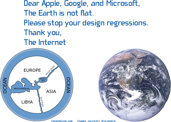
I think Windows 8 was pretty dumb as well but that doesn't mean I think flat UI or a modern UI in general is a bad idea. Of course we all have preference, but to me, saying we should go back 10 years in software design is like saying we should go back 10 years with hardware performance, car components, science research, education system, government laws, health and safety guidelines, etc.

You can't just "go back". The entire world is constantly surrounded by new smart phones and computer systems, the term here is "ubiquitous computing". All the companies want to get ahead of the game in design for appearance and user experience to get an extra leverage on making more sales and keeping existing customers.

No matter what design you have, you can never please everyone. There will always be people who prefer the previous or want something better. That is just something that happens in life. I want a Ferrari but I know it isn't going to happen. That doesn't mean all Ferrari's are stupid and should be banned from being driven by people who do happen to be able to afford them.

It is what it is, and in reality it is just preference. It would be unrealistic for me to tell someone "All UI styles apart from Flat UI are stupid because I prefer Flat UI and Flat UI is the best for the entire world because of this" because it is just a preference which I've adapted to and enjoy having while it lasts. At the same time, saying that any UI other that Flat UI is stupid would just be an opinion as well, a preference of preferring another style of artwork and taking a disliking to the one in question. None of it is factual.

What is factual though is that certain styles are applied for certain environments, and/or the trend demand. That isn't about whether a design is good or not, but it's business. Companies are constantly trying to make changes to find ways to improve user experience, make sure colours are matching up well, brainstorm and implement new ideas which they believe is innovative. They can't plan a UI for ages and expect everyone to like it. They can work hard, take risks and hope for the best. What if it doesn't work out? Keep trying, or scrap it and try something else.

Look at Avast. They started trying with ideas like this.

avastscanner.jpg


Then they started trying things like this.

avast_free_antivirus-330947-13969524750.jpeg


Now they are trying things like this.

Avast-Internet-Security-Download.png


There's a huge difference. Notice how the Status tab is pretty much empty? Maybe they thought it would be easier for it to be this way, so it truly is simple and minimal, nothing confusing. Just straight to the point of whether you're protected or not by default. One more click and you are at the Protection settings, or one click away from all the Settings. Whether it is a good or bad UI is down to you, but my opinion is that what they are trying is maybe a step forward.

Now let's take a look at Windows XP.

77F26313-307B-45C7-BE813FBF7473BA98_source.jpg


As @Umbra said, Windows isn't just for Desktops anymore. If you look at the XP UI in general, things tend to be much smaller by default like the task bar, start button, etc.

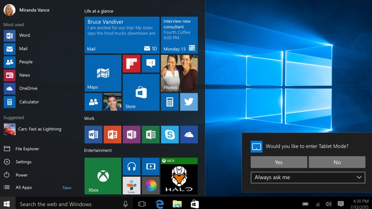
Now let's look at Windows 10.

RE1lflW


Now if you ask me, the Windows 10 UI looks much more adapted for a cross-device functionality. You could say that Microsoft could do a whole separate UI for mobile, but then we are back to user experience and not just appearance of styling! If you have customers using Windows Mobile and a PC with Windows 10, it is likely going to be a lot easier and hassle-free for them to have a similar experience across both devices... Thus they don't have to re-learn more for each separate device, they'll be used to the feel and usability. Notice how the UI components tend to appear bigger? Less perfection with moving the mouse, quicker actions.

This isn't me saying one UI is "better" than the other because of my preference, I am just trying to explain that there is so much more to it than what meets the eye. So many factors come into play.... Your target market, the general trend people are statistically liking, what other companies are being successful with, ease of use, performance on resources with animations, etc.

When I was brought up, we had a PS1 or PS2, Nintendo DS and a PSP 3000. Now we have a Nintendo Switch and a PS Vita, or a PlayStation 4. Why? Demand! Target markets! An teenager probably wants to play an Call of Duty game nowadays, not a 3+ Mario Kart game on a 10 year old Nintendo DS. That doesn't mean the old Nintendo DS was awful nor the game, it is just how things have changed. The Nintendo Switch being a DS replacement for younger children, the Xbox One/PS4/Gaming PCs being a replacement for teenagers, while still having features for younger players. It's all part of the designing world and how we as humans change over generations.

Designing is a true work of art, a masterpiece. It cannot be rushed and it can never be fully completed, because as said, you can never please everyone. If we stick to the same thing forever, it is like never trying to figure out the cure to life threatening diseases, and just sit assuming the world will solve itself out for us. That is no way to live in my opinion... We need to experience new things by progressing, using our improved resources to our ability to try and innovate as much as possible.

You never know what is around the corner, never ever count your chickens. Life is life, designing is designing. Everyone is different. We all have different minds and imagery. This is why designing is so exciting, because you never know how people will react. A majority may love or hate it... Trial and error, you live and learn. :)

Take it how you want to take it, use whatever UI you want. But the way I see it, there's so much more to this. Change can be good sometimes. We can't find something more convenient for specific purposes if we don't attempt to! E.g. I am sure a pen eraser is convenient for someone who prefers using a pen but is in fear of mistakes, now they don't have to use a pencil if they hate them.
 
Last edited by a moderator:

Faybert

Level 24
Verified
Top Poster
Well-known
Jan 8, 2017
1,318
Yeah I'm glad that I didn't use it back then, that just shocking IMO.
I never used it, I saw a lot of it on the computers of friends, here in Brazil at the time (2007 or 2008 I think) was the preferred AV of "computer technicians", people would take the computer to format and won the computer formatted with Avast "enabled" :p
 
  • Like
Reactions: 1 person
Status
Not open for further replies.

About us

  • MalwareTips is a community-driven platform providing the latest information and resources on malware and cyber threats. Our team of experienced professionals and passionate volunteers work to keep the internet safe and secure. We provide accurate, up-to-date information and strive to build a strong and supportive community dedicated to cybersecurity.

User Menu

Follow us

Follow us on Facebook or Twitter to know first about the latest cybersecurity incidents and malware threats.

Top