silversurfer
Level 85
Thread author
Verified
Honorary Member
Top Poster
Content Creator
Malware Hunter
Well-known
- Aug 17, 2014
- 10,171
Take a look at the section here or select from the links below to continue exploring Windows 11 in our ongoing "Closer Look" series:
- Closer Look: Search in Windows 11
- Closer Look: Widgets in Windows 11
- Closer Look: Start menu in Windows 11
- Closer Look: Snap Layouts and Snap Groups in Windows 11
- Closer Look: Taskbar in Windows 11
- Closer Look: Quick settings and notifications in Windows 11
- Closer Look: Virtual Desktops in Windows 11
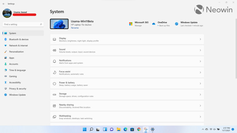
- Closer Look: Power and battery settings in Windows 11
- Closer Look: Default apps settings in Windows 11
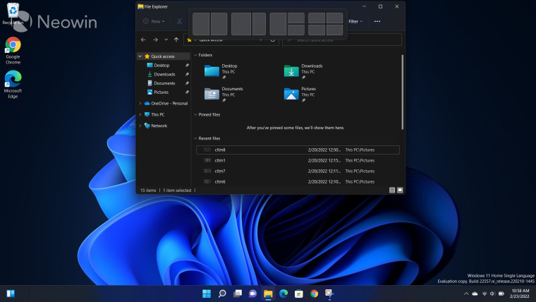
- Closer Look: File Explorer in Windows 11
- Closer Look: Context menus in Windows 11
- Closer Look: Microsoft Teams integration in Windows 11
- Closer Look: Clock app in Windows 11
- Closer Look: Microsoft Store in Windows 11
- Closer Look: Snipping Tool in Windows 11
- Closer Look: Paint in Windows 11
- Closer Look: Lock screen in Windows 11
- Closer Look: Photos app in Windows 11
- Closer Look: Voice typing in Windows 11
- Closer Look: Storage settings in Windows 11