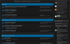
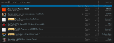
Maybe lose the glassesI love dark theme but some text are difficult to understand...
Introducing the "MalwareTips Dark" theme
- Thread starter Jack
- Start date
You are using an out of date browser. It may not display this or other websites correctly.
You should upgrade or use an alternative browser.
You should upgrade or use an alternative browser.
- Status
- Not open for further replies.
I use glasses as my first priority but I'm still blindMaybe lose the glasses
Dark, not as blinding for my late night DJ sessions 
yes sir I'm still logged in still can't view any of the attachments in this thread, was able to view attachments in an other thread out of this section, may be something related to permissions in Front Desk forums for our usergroupWere you logged in when you were trying to view the images?
Sometimes permissions get changed either accidentally or during updates to the forum software.@Jack will take care of ityes sir I'm still logged in still can't view any of the attachments in this thread, was able to view attachments in an other thread out of this section, may be something related to permissions in Front Desk forums for our usergroup
@Tani To change the theme, either links should work:
- Style Chooser: http://malwaretips.com/misc/style
- Preferences: http://malwaretips.com/account/preferences
Find the original white theme much easier to read, though I would love to have it dark though as it looks cool 
I can't decide if I like the light or dark theme better... guess that makes it a tie.  Either way, thanks Jack!!
I tend to like dark in forums, because it helps eyestrain. But I think this is too much of a good thing. A little brighter would be better.
Usually I use my own theme here, via local CSS, which tones down the brighter elements of the standard theme. I'll try this for a while. Thanks.
Addendum: yes, the colors on the front page and the form pages are way too muted for my eyes. I need more contrast than this.
Usually I use my own theme here, via local CSS, which tones down the brighter elements of the standard theme. I'll try this for a while. Thanks.
Addendum: yes, the colors on the front page and the form pages are way too muted for my eyes. I need more contrast than this.
H
hjlbx
@Jack - a greater value for lettering would reduce eye-strain while using Dark theme.
Value = brightness.
Blue and grey lettering not quite bright enough...
Of course, this will be highly variable from user system to user system dependent upon monitor, graphics and power settings.
I have new i7 system using 4500 graphics with above average quality monitor and High Performance power settings.
- Status
- Not open for further replies.
You may also like...
-
SOpera Listens: Introducing New Community-Inspired Themes to Opera One
- Started by Santiago Benavides García
- Replies: 0
-
SOpera updates with a redesigned History, new Themes, and an experimental feature
- Started by Santiago Benavides García
- Replies: 9
-
Guide | How To How to enable Dark Mode for VLC media player on PC
- Started by lokamoka820
- Replies: 10
-
SOpera One is updated with more dynamic Themes and a new privacy feature
- Started by Santiago Benavides García
- Replies: 0
-
SOpera One R3 arrives with new AI, Google integrations, and more
- Started by Santiago Benavides García
- Replies: 0


