

The MalwareTips app
Your community, one tap away.
Open MalwareTips from your Home Screen or desktop. Follow discussions, find answers and pick up where you left off.
- Home Screen access
- Optional push alerts
- Your community
You're ready to explore.Explore what's new
Installation instructions
iPhone & iPad
- Open MalwareTips in Safari and tap Share. You may need to open the Page Menu first.
- Choose Add to Home Screen. If it is not listed, use Edit Actions to add it.
- Keep Open as Web App enabled if shown, then tap Add.
Android
- Open MalwareTips in Chrome or another browser that supports app installation.
- Open the browser menu and look for Install app, Install and create shortcut, or Add to Home screen.
- Choose Install and confirm. Wording varies by browser.
Desktop
- Chrome: use the install icon in the address bar, or the menu under Cast, save and share.
- Edge: open the menu, then More tools, Apps and Install this site as an app.
- Safari on Mac: choose Share or File, then Add to Dock. Firefox on Windows: look for the web apps button in the address bar.
If you cannot find an install option, update your browser or use its bookmark option to keep MalwareTips close.
Keep up with your conversations
After installation, open the app and sign in. Enable push notifications in Preferences if you want alerts. On iPhone and iPad, push requires a Home Screen web app and iOS or iPadOS 16.4 or later.
Sign in to manage notificationsInstallation is optional. Your notification settings stay under your control.
You are using an out of date browser. It may not display this or other websites correctly.
You should upgrade or use an alternative browser.
You should upgrade or use an alternative browser.
By Staff Site Issues and Feedback
-
 Thread starter
Jack
Thread starter
Jack
- Start date
- 2,059 Replies
- 419,526 Views


I can confirm now I can log in the forum using my Google Titan Key via passkey 

I like this newly added theme; it is easy on eye than the bluish one.

But where is the "new" section? It is gone!
But where is the "new" section? It is gone!

The Dark theme is now available again!
You can switch to it by visiting your preferences page.
I’ll now focus on fixing the smaller bugs and issues you’ve reported. Thanks a lot for all the feedback — it may take a few days to get everything back in place, but it will be done. Appreciate your patience and support!
You can switch to it by visiting your preferences page.
I’ll now focus on fixing the smaller bugs and issues you’ve reported. Thanks a lot for all the feedback — it may take a few days to get everything back in place, but it will be done. Appreciate your patience and support!
F
ForgottenSeer 94738
I've always been of the opinion that the content of the posts in a forum is the most important thing. After studying the posts here, I obviously have to correct my mistake. The appearance of the forum seems to be much more important.

I think we have been just focusing on one aspect in this thread recently. I personally believe MWT has unique content/interests and a very supportive community. People also like shiny and pretty things. You can always post a survey to get a more comprehensive look.The appearance of the forum seems to be much more important.


Thank you @Jack!The Dark theme is now available again!
You can switch to it by visiting your preferences page.
I’ll now focus on fixing the smaller bugs and issues you’ve reported. Thanks a lot for all the feedback — it may take a few days to get everything back in place, but it will be done. Appreciate your patience and support!
View attachment 290963
Some bugs I noticed:
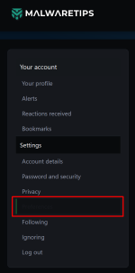
1. In https://malwaretips.com/account/preferences selected page in sidebar is barely visible
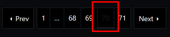
2. Current page number in threads is also barely visible.
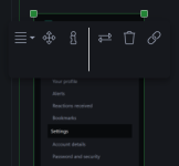
3. When adding image, toolbar that shows up is too big.
In editor text is dark gray, and on published posts it's a bit whiter and more easy to read. Example:



For me, it the reverse; large with "MalwareTips Dark" and small with "MalwareTips Dark Back".Hi! @Jack
Fonts in theMalwareTips Dark Backtheme are too big at the moment.
I think they should be the same size as the MalwareTips Dark theme.
Maybe jack has seen my comment already. Now both themes font size is the same for me.For me, it the reverse; large with "MalwareTips Dark" and small with "MalwareTips Dark Back".
Personally I prefer the larger font of MalwareTips Dark; it is easier for reading; just if its bluish theme color be a more eye-friendly one, such as dark greenish or reddish, or even greyish.Maybe jack has seen my comment already. Now both themes font size is the same for me.

Thanks Jack! Appreciate it!The Dark theme is now available again!
You can switch to it by visiting your preferences page.
I’ll now focus on fixing the smaller bugs and issues you’ve reported. Thanks a lot for all the feedback — it may take a few days to get everything back in place, but it will be done. Appreciate your patience and support!
View attachment 290963

Me spending the time trying the newly added themes:Did you tweak the MT Dark theme again @Jack? It seems like the blue colorways have been toned down. Or maybe it's just me.I'll keep using this for now. Thanks!

F
ForgottenSeer 123960
In the fast-paced digital landscape, the decision to upgrade your forum's software and embrace a modern design is more than just a cosmetic touch-up. It's a strategic move that can significantly impact user engagement, community growth, and the overall health of your online space. From enhanced security and mobile accessibility to a more intuitive user experience, the reasons to modernize are compelling and crucial for long-term success.

@Jack maybe it's me, but with previous forum software, new unread Alerts were very obvious to distinguish from ones already read. Running firefox in linux, it is harder to for me to distinguish the new unread posts from the Alerts dropdown list. I do see a small black dot on the bottom right of each post blurb but only when I place mouse cursor over that post blurb. (Maybe there's a button somewhere I have not correctly pushed...  ) I running default light theme as I never tweaked it before or now.
) I running default light theme as I never tweaked it before or now.
How to access the "Latest Threads" not "Latest Posts"in this new UI?

Oh Jack had a vision, a theme so divine, He said “Let’s go darker!” — now we squint all the time.In the fast-paced digital landscape, the decision to upgrade your forum's software and embrace a modern design is more than just a cosmetic touch-up. It's a strategic move that can significantly impact user engagement, community growth, and the overall health of your online space. From enhanced security and mobile accessibility to a more intuitive user experience, the reasons to modernize are compelling and crucial for long-term success.
Fonts got fancy, the scroll bar ran away, And half the buttons play hide-and-seek every day.
Click the moon, click the sun, Now the layout’s on the run!
Intermediate theme, what does that mean? Is it light? Is it dark? Or just somewhere in between?
Recently browsing
Members who viewed this thread in the last 5 minutes


