Planned software upgrade - Feedback

Status
Not open for further replies.

Gandalf_The_Grey

Level 76
Verified
Honorary Member
Top Poster
Content Creator
Well-known
Apr 24, 2016
6,506
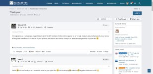
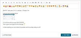
XenForo uses one PNG file which will have all of the emoticons on it beneath one another, so when you add an emoticon into the post, it will use the same PNG for every single emoticon except the image's content position will be changed to put the right emoticon into view.

So it must be the positioning and hence that is why your emoticon is being cut off on Google Chrome. You can see from your demonstration image that half of another emoticon is being showed as well.

I'm using Google Chrome (latest version) and I haven't had this problem though... I am also on Microsoft Edge and there's no issue there. I can't seem to replicate the issue while using 125% or 150% zoom on either Google Chrome or Microsoft Edge either.

It might be worth a shot to see if the issue doesn't happen when you put the zoom back to default to test it.
If I put Windows scaling on default (100%) as soon as I zoom with Chrome I get the problem and again no problem with Edge. Not sure what I can do about it.
It's a Chrome thing, because when trying Vivaldi the problem is not there. Will try a new install of Chrome. Hope that helps.
 
Last edited:
  • Like
Reactions: upnorth

tim one

Level 21
Verified
Honorary Member
Top Poster
Malware Hunter
Jul 31, 2014
1,086
Sure, I think this is the new software behavior, however it's not hard to change it. It's on my to-do list.

---
Made some more changes to the MWT 2018 BETA style, feedback is welcomed.
View attachment 187087
I'm using that @Jack, currently not seeing any bugs. It seems really faster and smooth compared to the default one , just my impression.
 
Last edited:

Gandalf_The_Grey

Level 76
Verified
Honorary Member
Top Poster
Content Creator
Well-known
Apr 24, 2016
6,506
If I put Windows scaling on default (100%) as soon as I zoom with Chrome I get the problem and again no problem with Edge. Not sure what I can do about it.
It's a Chrome thing, because when trying Vivaldi the problem is not there. Will try a new install of Chrome. Hope that helps.
And unfortunately a clean install of chrome doesn't help.
 

CyberTech

Level 44
Verified
Top Poster
Well-known
Nov 10, 2017
3,247
---
Made some more changes to the MWT 2018 BETA style, feedback is welcomed.
View attachment 187087

Oh it looks so pretty, the font is my favorite tbh :D

GeneralReadyHermitcrab-size_restricted.gif


Edit: im using Opera, i will report here if any problem..
 

Bleak

Level 4
Verified
Well-known
Sep 5, 2017
149
Really like the removal of Likes numbers on member's info side. Looks more cleaner, less bloated! I hope that won't come back.
 

upnorth

Moderator
Verified
Staff Member
Malware Hunter
Well-known
Jul 27, 2015
5,457
Why have any information/text at all under the Avatars as when anyone hoover with the mousepointer over the Avatars most of the basics popup anyway but, IMO it's a static profile information that shouldn't be hidden. Your forced to click the toggle option to see for example what OS or AV is used. The more members/guests is forced ( click ) to access/read hidden information the bigger the risk is that they simply won't or skip even if the feature/option is smooth and easy.

Having anyone start ignore or make it harder to access information no matter big or small is a slippery slope IMO ( that even includes in some part the click option to expand on quotes ) and feels counterproductive as most of this place is about information and personal I like to know a few basics about members that reply or create threads as I have a hard time to remember everyones basic information 24/7 or I can ofcourse just click but I rather have a few less clicks then more but guess I'm old school.
 
Last edited:

amico81

Level 21
Verified
Top Poster
Well-known
Jan 10, 2017
1,061
Why have any information/text at all under the Avatars as when anyone hoover with the mousepointer over the Avatars most of the basics popup anyway but, IMO it's a static profile information that shouldn't be hidden. Your forced to click the toggle option to see for example what OS or AV is used. The more members/guests is forced ( click ) to access/read hidden information the bigger the risk is that they simply won't or skip even if the feature/option is smooth and easy.

i would confirm this opinion. I don't like the new popup under the avatars. So we don't need the information about a member if we can hide it
 

Prorootect

Level 69
Verified
Nov 5, 2011
5,855
Or to have on clear number of posts only.
Sure, all (other) informations we get by hovering the Avatar with the mouse.
 

mekelek

Level 28
Verified
Well-known
Feb 24, 2017
1,661
i would confirm this opinion. I don't like the new popup under the avatars. So we don't need the information about a member if we can hide it
coding wise it's easier to be default closed then saving every user's preference. additional database queries can slow down things.
 
  • Like
Reactions: vtqhtr413
Status
Not open for further replies.

About us

  • MalwareTips is a community-driven platform providing the latest information and resources on malware and cyber threats. Our team of experienced professionals and passionate volunteers work to keep the internet safe and secure. We provide accurate, up-to-date information and strive to build a strong and supportive community dedicated to cybersecurity.

User Menu

Follow us

Follow us on Facebook or Twitter to know first about the latest cybersecurity incidents and malware threats.

Top