By Staff Site Issues and Feedback

  • Jack Thread starter Jack
  • Start date Start date
  • 2,059 Replies
  • 419,476 Views
I would love to set it back to V2. (The Dark version. :) )
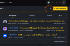
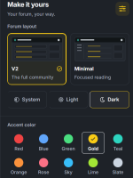
I had the same problem, until I figured out (from incognito, non-logged screen), that I can do this from the home screen:

1792331054449.png1792331067439.png
The difficult part was my dark extension is hiding the circled button on the home screen.

@Jack : I don't know what you did, but V2 (dark, fixed width) is now my screen of choice. 👏🎉🎊
 
@Jack : I don't know what you did, but V2 (dark, fixed width) is now my screen of choice. 👏🎉🎊

Until today it was mine as well, but now it looks really white and empty for me. Hopefully it can be resolved, because I cleared my browser several times, and that has not helped me at all.

Clearing the browser cache solved the issue for me.

Not for me. :(
 
Hi @Jack,

First of all, thanks for all the work you're putting into the new design and for how quickly you're addressing the issues that come up.

I wanted to share my personal experience. I mainly access the forum through my PC's web browser, and after trying both versions, I still feel more comfortable with V1, especially V1 Dark.

In my experience, V1 feels smoother and more comfortable to navigate, making it easier for me to move between threads and find the content I'm looking for, while with V2 I sometimes notice slight pauses. I also find V1 more visually appealing, and its dark theme is more comfortable for me during long reading sessions.

I understand that V2 is still evolving, but I wanted to share this personal impression in case it's useful.

Thanks again for all the hard work and dedication. 🙂👍
 
I'm not fancying this new grey color change on V2 Dark, the V2 color that we had for the last few weeks looked much better, IMO.
I could be wrong, but text size/size of everything seems to have gotten slightly bigger after this color change.
Text size-wise, V1 is still perfect for me. On V2, even at Small Reading size, everything is bigger.
I am also seeing annoying lags while deleting texts using the backspace button. The lag was manageable before in V2, but it has increased after this grey color change.

I agree. I'm not liking the grey at all.
 
@Jack thanks for the modifications you made to the new theme, it’s much better now than before. However, I have an issue with the status page—it doesn’t let me click on images to enlarge them, so I have to visit the member’s profile to see the image on their wall, where it works as it should.
 

Recently browsing

Members who viewed this thread in the last 5 minutes

Back
Top