
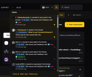
Not sure if it’s just me or if anyone else has noticed, but I can’t really tell the difference between read and unread alerts in the new dark mode theme. All the rows look the same shade, or maybe I’m missing something?


Open MalwareTips from your Home Screen or desktop. Follow discussions, find answers and pick up where you left off.
If you cannot find an install option, update your browser or use its bookmark option to keep MalwareTips close.
After installation, open the app and sign in. Enable push notifications in Preferences if you want alerts. On iPhone and iPad, push requires a Home Screen web app and iOS or iPadOS 16.4 or later.
Sign in to manage notificationsInstallation is optional. Your notification settings stay under your control.
 Thread starter
Jack
Thread starter
Jack


It is cached for for 3 minutes for performance reasons. You're offline nowI also have another question.
How long does the red frame keep spinning after a member log-out?
View attachment 300229

Give me a few minutes and it will be fixed.Not sure if it’s just me or if anyone else has noticed, but I can’t really tell the difference between read and unread notifications in the new dark mode theme. All the rows look the same shade, or maybe I’m missing something?
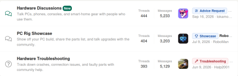
I have redone the descriptions of the forums.Is it just me, or with the new buttons, I'm not seeing as much text as previously, of where specifically a sub forum's newest post was or idea of the the post? With the few letters in the Security apps we have an idea, but otherwise?
View attachment 300231

I have redone the descriptions of the forums.

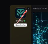
Fixed..Not sure if it’s just me or if anyone else has noticed, but I can’t really tell the difference between read and unread alerts in the new dark mode theme. All the rows look the same shade, or maybe I’m missing something?
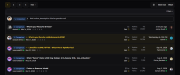


I noticed something when switching between the logged‑in and logged‑out views of the forum.When browsing as a guest, the homepage shows a long stream of mixed ‘cards’ from different sections — for example threads like What is your Favourite Browser? or Quick Play with McAfee, among many others. It creates a very busy, magazine‑style layout with content from all categories blended together.
But once logged in, all those cards disappear and the forum becomes much more structured: only the main section titles are shown, and the threads are neatly organized inside each one. Personally, the logged‑in layout feels cleaner, easier to scan, and more consistent with the forum’s structure.
Just wanted to share this observation. The simplified layout without the cards feels visually more comfortable and easier to navigate.

Fixed now; thank youThe only downside, it causes a constant extra 8-10% CPU usage

It is backFixed now; thank you
Thank you! By the way, I really like the new reaction icons—they’re a great addition.Fixed..
The read/unread distinction should be much easier to spot now.
Unread notifications, PMs and threads now have a more visible accent highlight and indicator dot, so you can quickly see what’s new at a glance.
View attachment 300239
View attachment 300240



Try it now, it should be fixed.Today I noticed the new style of MalwareTips Forums.
I did find an issue almost immediately when preparing a posts.
Text that I added a URL to were not underlined or a different color, so you would have no idea that they contained a link when looking at it in the post editor.
The text above the link is all clickable links except for the word By, but you can not tell that by looking at it (the red underlines and highlights are from the free and open source grammar and spell checker Harper, you can ignore that):
View attachment 300249
Members who viewed this thread in the last 5 minutes


