


Setup PCPC setup
I'll be honest: most of my Favorites have white accents so there's some contrast with the red/blue. The darker green MT icon loses some assertiveness the smaller it gets. It's nice when it's in a thumbnail or otherwise enlarged, against a dark background. I tried it w/Edge + light theme--not so much my taste.
It's OK. It's definitely more stylish in certain cases, like a Dark theme.
It's OK. It's definitely more stylish in certain cases, like a Dark theme.
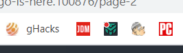


 i dont like this green color....


