You can hide the sidebar:Well, I found the old look much more compact. Also, I don't need to see who's online today when I look at a topic. This is the task from the start page. I like both looks.
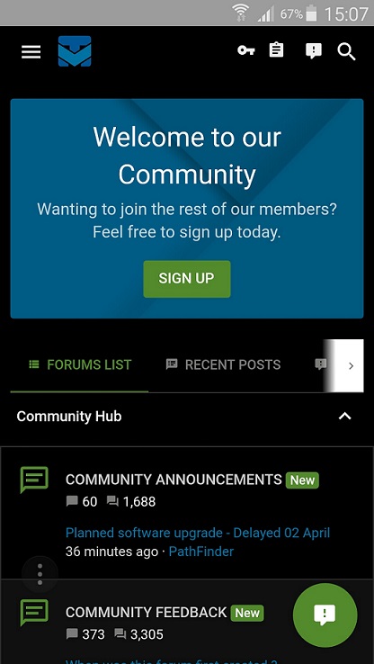
Planned software upgrade - Feedback
- Thread starter Jack
- Start date
You are using an out of date browser. It may not display this or other websites correctly.
You should upgrade or use an alternative browser.
You should upgrade or use an alternative browser.
- Status
- Not open for further replies.
D
Deleted member 178
@Jack I miss the "recent post" in the scroll menu of "Forum"
@Jack Can you make Quote button on posts, to say if post is added to multi-quote or not; because sometimes I accidentally click on it and I don't know which post is selected, and which one is not. ")
It was there earlier but now it has gone.I miss the "recent post" in the scroll menu of "Forum"
D
Deleted member 178
i see.It was there earlier but now it has gone.
@Jack Also, in Dark Theme, it would be nice if on the recent/new posts thread list, we could have the already read threads be in white fonts again.
thank god for the midnight theme's return, my retina was crying
D
Deleted member 65228
I found something that was missed.
If you scroll down to the bottom of the forum page, the 'Contact us', 'Terms and rules', 'Privacy' and 'Help' links will turn light when you hover over them, preventing you from reading the link text contents whilst the mouse is over them.
I did a quick inspection on the CSS and couldn't find an existent :hover selector in CSS for the list items on the footer, potentially it is embedded in the XenForo theme somewhere and isn't found easily. I did a test by adding some additional CSS to my own session by adding the following.
After applying this CSS to my session, the text on the list item links are now once again visible on-hover.
You won't be able to see my cursor on the print-screen however in the below images I am hovering over the list item links on the footer.
Before.

After.

If it was intended to be light on hover then my bad, but I gathered it is just a little non-important thing to mention for when all the important stuff has finished been taken care of later on if a change needs to be made to it!
[Edit]
Wow, the code snippet area on the posts for this new theme looks really nice. The spoiler buttons as well, they look brilliant. I also noticed the new transition effects for sliding and drop-downs and they look awesome as well in my opinion!
If you scroll down to the bottom of the forum page, the 'Contact us', 'Terms and rules', 'Privacy' and 'Help' links will turn light when you hover over them, preventing you from reading the link text contents whilst the mouse is over them.
I did a quick inspection on the CSS and couldn't find an existent :hover selector in CSS for the list items on the footer, potentially it is embedded in the XenForo theme somewhere and isn't found easily. I did a test by adding some additional CSS to my own session by adding the following.
Code:
.p-footer-linkList
li
a:hover {
    color: #0073aa;
}
After applying this CSS to my session, the text on the list item links are now once again visible on-hover.
You won't be able to see my cursor on the print-screen however in the below images I am hovering over the list item links on the footer.
Before.
After.
If it was intended to be light on hover then my bad, but I gathered it is just a little non-important thing to mention for when all the important stuff has finished been taken care of later on if a change needs to be made to it!
[Edit]
Wow, the code snippet area on the posts for this new theme looks really nice. The spoiler buttons as well, they look brilliant. I also noticed the new transition effects for sliding and drop-downs and they look awesome as well in my opinion!
I
illumination
Just wanted to say WOW, what a clean/modern look, and mobile experience is outstanding... Im sure once you iron out the deficiencies it will be absolutely awesome!
Recent posts is not gone!

Theme: MalwareTips Default Theme..
Theme: MalwareTips Default Theme..
Really love this theme ( the Default white one )
If guest is not registered, Sidebar doesn't toggle...Sidebar is not good (to me...) if on the right...
"Currently Online" and "Most Posts" are not indispensable hmmm
"'Recent Posts" and "Latest Threads" are indispensable at the top of sections, always (e.g. Browsers and Extensions etc) - like before...if not, we are cut from events on the website...
I've noticed new 3rd party: cdn.materialdesignicons.com to forbid...
No reaction, if I touch with the mouse the "Alerts" icon or "Conversations" icon, or my nice "Account" icon... if I click at these icons, is OK.
If not all is good, but I use, for darking the pages, the extension/add-on called Dark Mode, which works on all websites.
Thank You Jack for your great work to introduce this new website change!
PS.
I'm on "MalwareTips 2018" theme, for now
Last edited:
- Jan 16, 2017
- 1,470
- 13,500
- 2,379
I hope you add "Recent posts" option in this blue bar

I'm still confused about Recent posts and Unread posts. Which of these two shows new topics? 
I have a strange behavior with the mouseover if there is a video in the thread. I uploaded a gif.

I'm still confused about Recent posts and Unread posts. Which of these two shows new topics?
Recent Posts mean our members posting in the thread its called ''Recent'' obviously and Unread Posts that mean you havent read it yet since they are new threads or new posts so they will be gone after you read it or later
that mean dont waste your time to read all new posts which you know you seen it i would say Unread posts is better Got it! Thanks!Recent Posts mean our members posting in the thread its called ''Recent'' obviously and Unread Posts that mean you havent read it yet since they are new threads or new posts so they will be gone after you read it or later
Just entered and saw the new theme.So far i like it,even the default one
IMO " Latest Posts " should perhaps be where " Most Posts " is on the main page. Most posts is statistic information and fits better with Forum and Online Statistics or why not use the Most Posts-Past 7-10 Days as seen on other pages then the main page. Just an idea.
I agree! I'd rather see Latest posts than Most posts in sidebar, on the main page.IMO " Latest Posts " should perhaps be where " Most Posts " is on the main page. Most posts is statistic information and fits better with Forum and Online Statistics or why not use the Most Posts-Past 7-10 Days as seen on other pages then the main page. Just an idea.
- Status
- Not open for further replies.
You may also like...
-
 App Review McAfee Protection (Plus Plans, Total Protection, LiveSafe)
- Started by Trident
- Replies: 413
-
 Technology IBM now describing its first error-resistant quantum compute system
- Started by oldschool
- Replies: 0
-
Serious Discussion Data Collection Core Principles (Security Software)
- Started by Trident
- Replies: 7
-
S
-
SOpera One R3 arrives with new AI, Google integrations, and more
- Started by Santiago Benavides García
- Replies: 0