By Staff Site Issues and Feedback

Community Feedback
1,879 Replies 407,819 Views
Hey Linux
I don't understand what are you asking @LinuxFan58 ... we are not sellign anything as far as I know :P ... What customer authorization (SCA) do you what me to add?
In the options you only have "doing online shopping entering bank or credit card details" that is so old fashioned nobody enters bank card details. Online shopping is done with SCA in most countries.
 
In the card with the TIPS?
No in the system (security) setup the choices at USAGE & EXPOSURE, but I see someone already removed entering card details and changed it to

1790264557647.png
 
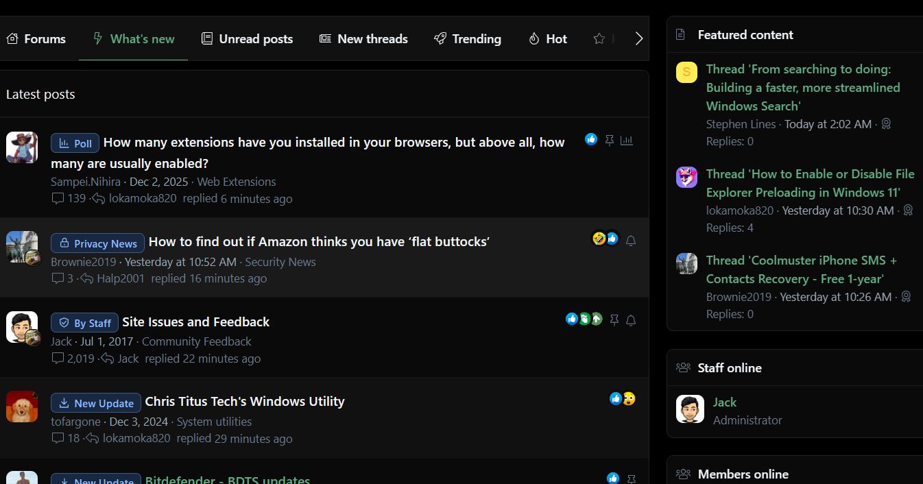
The new boxed style for the thread tags looks great. It’s cleaner, more consistent with the current forum layout, and makes each category easier to spot. Nice improvement. 👍👏

They're pleasant, and not "in your face" style of boxes. I especially like the Blue ones, nice clean look to them...well, all of them :)
And I'm viewing them, this site, without any dark mode enabled.
 
Last edited:
@Jack
Thank you for the new MT theme; now I can ditch using Yandex.
I had to stick to Yandex just to be able selectively disable "dark website flag" for MT which was hiding the boundaries of the top toolbar icons.
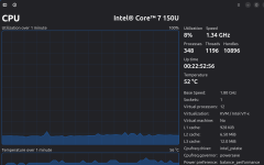
The only downside, it causes a constant extra 8-10% CPU usage 🙃
 
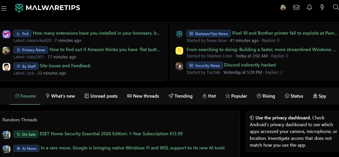
Interesting new layout, on my laptop, it's more scrolling and hunting to find (I tend to scroll, more than using the quick link icons), not a fan. On a smartphone, it could be different and better? But, I would actually pass on viewing this website, the way it is at this moment.

The user Avatar user information is different, compact view :)
 
Can we keep the old theme non dark theme? I find any new theme terrible with everything being bold and hard to read and me having to scroll 1 min to go past 5 threads.
 
Interesting new layout, on my laptop, it's more scrolling and hunting to find (I tend to scroll, more than using the quick link icons), not a fan. On a smartphone, it could be different and better? But, I would actually pass on viewing this website, the way it is at this moment.

The user Avatar user information is different, compact view :)

Thank you for bringing the old layout back @Jack I know we're experimenting :) I did take some screenshots just in case someone thought I was seeing things and was back on the magic mushrooms again 😂😂
 
Last edited:
I, on the other hand, find what’s highlighted by the red arrows very inconvenient:

1.png

Usually, when I log in to MT, I check the “What’s New” section, and it seems to me that finding this page is more complicated than it used to be.

I also find the “online members: 26.....more” display more inconvenient, even for logged-in users themselves (who can’t see it).
 
I, on the other hand, find what’s highlighted by the red arrows very inconvenient:

View attachment 300228

Usually, when I log in to MT, I check the “What’s New” section, and it seems to me that finding this page is more complicated than it used to be.

I also find the “online members: 26.....more” display more inconvenient, even for logged-in users themselves (who can’t see it).
Thanks!

Can we keep the old theme non dark theme? I find any new theme terrible with everything being bold and hard to read and me having to scroll 1 min to go past 5 threads.
I used the 500/medium bold.. I'll see what I can do to improve it! :D
Interesting new layout, on my laptop, it's more scrolling and hunting to find (I tend to scroll, more than using the quick link icons), not a fan. On a smartphone, it could be different and better? But, I would actually pass on viewing this website, the way it is at this moment.

The user Avatar user information is different, compact view :)
Thanks!
 
Community
Security tip
Plan for a lost device. After creating a passkey, check where it is stored or synced and how you would sign in without your current phone or laptop.
Back
Top