Another reson is to not have a " long " window at all in the bottom as seen in the screenshot as it creates big empty spaces that IMO shouldn't need to be there. Very similar to the previous Dark theme.
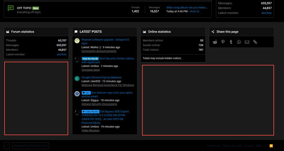

Another reson is to not have a " long " window at all in the bottom as seen in the screenshot as it creates big empty spaces that IMO shouldn't need to be there. Very similar to the previous Dark theme.
Should look better now, take a look & let me know what you think.quick note on the Midnight theme; the hover-over links color turning into a dark blueish doesn't look very good.
The links color could be a bit brighter, it's not immediately readable when you there's too many of them, as the following example.
Also, the footer links colors are nearly non visible (Contact us, privacy, etc.)
I agree with you. I really do not like the new look. It would be nice to have the option to change the theme to something resembling the old one.I don't like this theme at all. Previous one looked much cleaner.
")
Exactly. Last time Jack changed the design, I took a week or so to adjust. I preferred older one that time but after a week and I ended up liking the newer one more.Every change to something new is always a "bit traumatic" at 1rst