By Staff Site Issues and Feedback

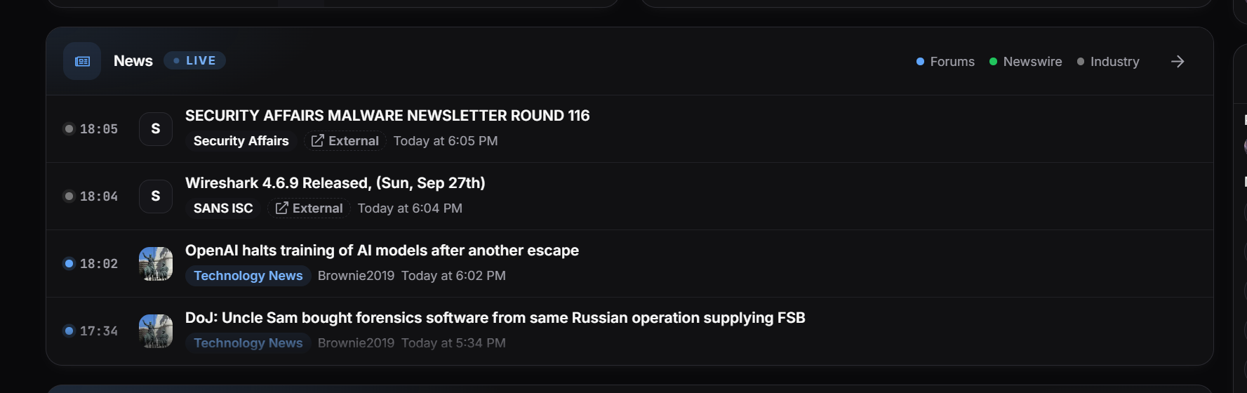
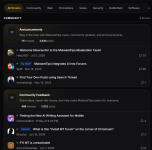
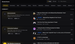
Also, we have changed the MalwareTips Newswire page and now the news come from our forum, newswire and industry sources.. basically you can find all the Security News in one place.

There is also a rolling news section on the main page where you can find the News from all sources and sorted by time.

1.png
 
@Jack I still prefer the old version. I thought the new version had too much information, and I found the home page too cluttered. Personally, I still prefer the old one—the one that’s currently online. Maybe with a few tweaks to the new one and a simpler layout, we’ll get used to it over time. :)
 
With the old one, idle cpu usage is 1-2%
With the new one, idle cpu usage is 8-15%

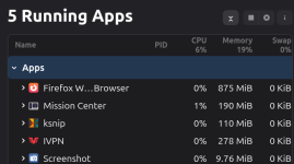
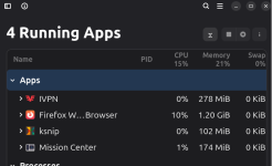
I found the same thing on my end. Mission Center tends to be more "realistic" as far as CPU and Memory numbers/percent than Windows Task Manager, so I'm usually idling around 4-5% CPU. With the straight V1 (not default V1) it was using less CPU ~6%, than Work in Progress V2 at ~15%. I just had this tab open in Firefox. Screenshot is an active app in one, while ksnip was on a timer in the other (4 apps running image). FWIW :) Edit: Dark mode was not enabled either from the site options, or from the Firefox Dark Background Light Text extension.

Screenshot from 2026-09-27 12-11-56.png ksnip_20260927-120919.png
 
Last edited:
I found the same thing on my end. Mission Center tends to be more "realistic" as far as CPU and Memory numbers/percent than Windows Task Manager, so I'm usually idling around 4-5% CPU. With the straight V1 (not default V1) it was using less CPU ~6%, than Work in Progress V2 at ~15%. I just had this tab open in Firefox. Screenshot is an active app in one, while ksnip was on a timer, so it didn't show up as an App in the other (4 apps running image). FWIW :)

View attachment 300318 View attachment 300320
No, it is just me 🙂
 
The new version home page is a little busy for me and it looks like it's designed for mobile users.
Thanks for mentioning the mobile part. Now I understand the rationale behind the V2 design and why it was giving me a headache.

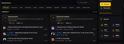
V2 is beautiful (with the customizable accents), shows a few entries for each panel automatically (nice! But for some panels that aren’t customizable, this can be annoying), and makes it easy to see a lot of content in one scroll (without clicking on anything) if you have a narrow screen (try reducing the width by half).

V1 is more readable on a wide screen. V2 presents the panels on my screen in two columns (with the more “fixed” rightmost status, etc., column) on a wide screen. This is why it gave me a headache: the reading flow (from left to right) is interrupted. When I narrowed the width to just one column, my headache went away.

1790543164973.png
Do some of the folks who have really wide screens have even more columns on their screens?

TL;DR: V2 has some elements that I like, including three entry expansion for each panel and customizable accent, but the multicolumn presentation doesn’t work for me when I’m reading on a desktop in full-screen mode.

I am not sure whether it’s possible to optimize for both mobile and wide screens, but I know some websites need to maintain both mobile and desktop versions, which I imagine is a headache.
 
Last edited: