Thanks for mentioning the mobile part. Now I understand the rationale behind the V2 design and why it was giving me a headache.
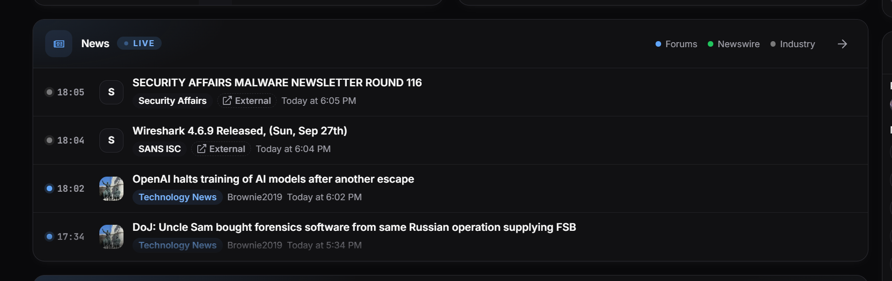
V2 is beautiful (with the customizable accents), shows a few entries for each panel automatically (nice! But for some panels that aren’t customizable, this can be annoying), and makes it easy to see a lot of content in one scroll (without clicking on anything) if you have a narrow screen (try reducing the width by half).
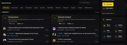
V1 is more readable on a wide screen. V2 presents the panels on my screen in two columns (with the more “fixed” rightmost status, etc., column) on a wide screen. This is why it gave me a headache: the reading flow (from left to right) is interrupted. When I narrowed the width to just one column, my headache went away.
View attachment 300328
Do some of the folks who have really wide screens have even more columns on their screens?
TL;DR: V2 has some elements that I like, including three entry expansion for each panel and customizable accent, but the multicolumn presentation doesn’t work for me when I’m reading on a desktop in full-screen mode.
I am not sure whether it’s possible to optimize for both mobile and wide screens, but I know some websites need to maintain both mobile and desktop versions, which I imagine is a headache.