Planned software upgrade - Feedback

Status
Not open for further replies.

upnorth

Moderator
Verified
Staff Member
Malware Hunter
Well-known
Jul 27, 2015
5,456
If i want to write a new profile post, there is nowhere within the profile posts page to do it. I have to come out and onto the main forum page and post from there, is this intentional ? It just seems like another waste of a click
The " Update your status " is in the Profile page, tested on all themes/skins but one have to click inside that window to see the Post button. Could be a reson why it get's missed. :unsure:
izrIcfr4_o.png

Profile posts also exist in the sidebar on the mainpage but it's sadly pushed down by the statistic window " Most Posts " that I again must mention should be replaced with something else IMO as it's very static and not something actual useful.
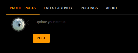
Yes, but that's even more clicks. I have to click on my little ugly mug up in the corner then click again to get to my profile page. Whereas before, if i was reading profile posts the little box was already there for me to write in.
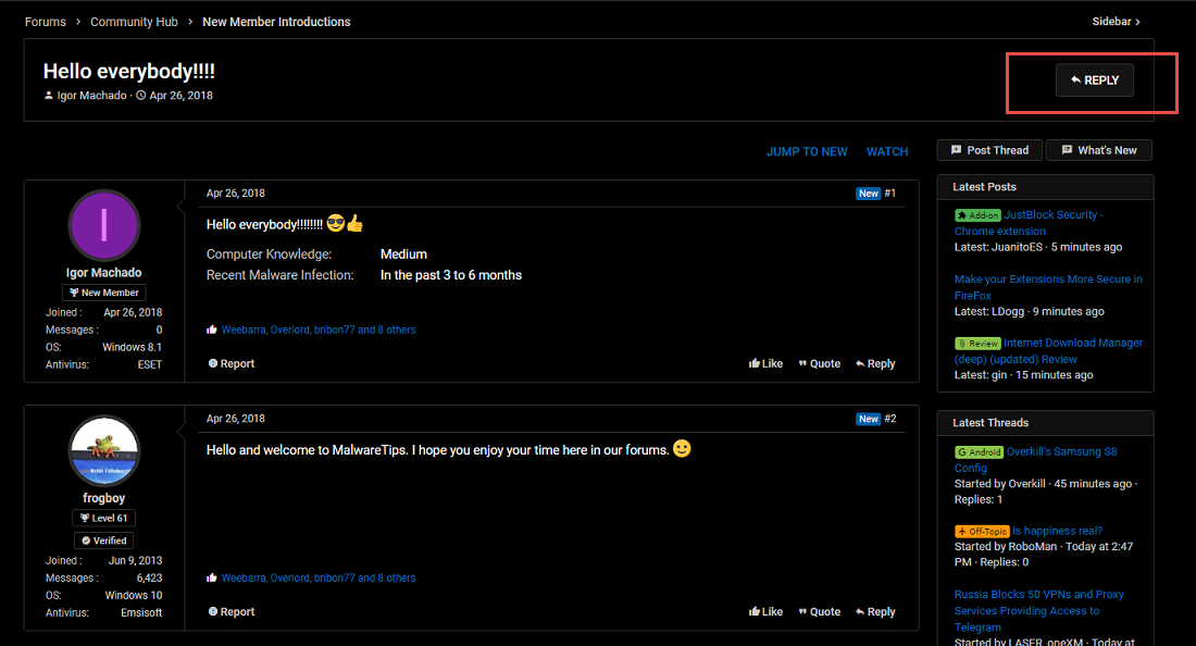
View attachment 188144

That I belive was what also @BryanB and I talked about but has now been replaced with a button in every thread that push you down to the reply window.
QFRFMvrM_o.png

I agree it's alot of clicks and it's great that you report it as it give @Jack a possibility to tweak if possible.
 
Last edited:

Jack

Administrator
Thread author
Verified
Staff Member
Well-known
Jan 24, 2011
9,377
Guys, I'm still working on the the page when viewing a thread..that was the hardest thing to do. Now, the sidebar - what it contains, and all the other pages - profile pages, new posts pages, forums list, forum view and category view are about to be customized. So for now, all the feedback should be focused on the page when viewing a thread - it's 95% ready.

Also, to be noted - you can easily update your status by using the drop-down menu from your control panel in the header (it's on all the page).
234.jpg
 

Weebarra

Level 17
Verified
Top Poster
Well-known
Apr 5, 2017
836
View attachment 188150

I know it's only a little thing, a couple of extra clicks but hey it's still feedback :p
I'm using MWT 2018 BETA X skin and I see those 2 buttons, always if You keep vertical sidebar enabled ;)


Oops, sorry for the confusion @harlan4096 , yes i have those two buttons too, The black box i drew is where the "update your status" bar used to be. I'm beginning to confuse myself as well as others, lol. It's really just to see if @Jack could incorporate it back to where it was, if it's not possible then i will just have to get used to it.:)
 

Jack

Administrator
Thread author
Verified
Staff Member
Well-known
Jan 24, 2011
9,377
I'm using MWT 2018 BETA X skin and I see those 2 buttons, always if You keep vertical sidebar enabled ;)

Yes, the sidebar is the same on all pages. If you remove it from the page, then you lose valuable information and functions. This is why I've been thinking so much on how to display the posts. This vertical alignment of the posts, will make the threads look clean and should be easier to read, while the sidebar won't feel like it's in your way.
 

Prorootect

Level 69
Verified
Nov 5, 2011
5,855
What's New:

To properly see the website icons like all in Reply Post window:
new third-party request to notch imperatively (in 3PRB...), called: maxcdn.bootstrapcdn.com

Jack know, that I don't like adding third-party requests (sorry!), cause this increases site loading time...

PS.
The sidebar doesn't toggle in Firefox ESR 52 and new Nightly/Basilisk (based on Firefox 55), but works on my ancient Nightly/Basilisk (based on Firefox 55 too)...
 
Last edited:

Prorootect

Level 69
Verified
Nov 5, 2011
5,855
Great, this awake!
Two third-party Today (on Firefox 52.7.4, seen in 3PRB add-on): ajax.gogleapis.com and cdn.materialdesignicons.com -
- and site loading (on first page of this topic) goes much faster here!
- or my computer is refreshed with this fresh morning...?

On Slimjet: 2.05 seconds best result - with four 3-rd party: cdn.materialdesignicons.com, fonts.googleapis.com, ajax.googleapis.com, googletagmanager.com, seen in ContentBlockHelper. 13 extensions.

On Cent: four 3-rd party requests (why this difference with Firefox?...): ajax, material, fonts.googleapis.com and googletagmanager.com, 3.00 seconds best result of loading the first page of this topic, in Page Speed Monitor extension. Here, 17 extensions horror all indispensables...:giggle:

so slimmer is better

PS.
After login in Firefox 52, I've had Latest Posts and Latest Threads in sidebar: in Chinese!:LOL:
- only once, but after refreshing the page everything was in English. Why this, maybe I've a Chinese virus here?...
 
Last edited:

Prorootect

Level 69
Verified
Nov 5, 2011
5,855
Correction for my precedent post:

My "RequestPolicy Continued" add-on gives me this information: on MT website, there are 57 requests (8 blocked and 49 not blocked) on the first page of this topic.
8 blocked third-party destinations are:
ajax.googleapis.com: 2
fonts.googleapis.com: 2
materialdesignicons.com: 2
and googletagmanager.com: 2
(Your ads blocker could catch googletagmanager.com, so disable AdGuard or uBlock to see it in RequestPolicy Continued...)

In Firefox about:config then I've increased network connections numbers, but I don't see any difference in page loading...
What I could do to improve this page loading again...I have 8 add-ons in Firefox ESR now...
 
Last edited:
D

Deleted member 65228

I have some ideas... but I don't know of anyone else will think they are good nor do I know how they good they'd be if actually implemented. I'll just dump them here. :p

1. A setting to toggle visibility of the Like button and the link text to the popup showing which members Liked a particular post. That way people who aren't interested at all in Liking posts or seeing who Liked them (e.g. prefer it old-school) can just not have to see it.

2. If more than 3 members report a post -> automatically hidden until staff have reviewed it. And of course, blatantly going out of your way abusing the functionality (e.g. false reports to censor people for no real reason) ends in a back-fire of consequence (warning, ban, or something else).

3. Profile page cleanup tool -> automatically clean your profile by having all status posts removed with filtering support to remove only ones made by you, only ones made by others, or even target comments only.
 

Bleak

Level 4
Verified
Well-known
Sep 5, 2017
149
I have some ideas... but I don't know of anyone else will think they are good nor do I know how they good they'd be if actually implemented. I'll just dump them here. :p

1. A setting to toggle visibility of the Like button and the link text to the popup showing which members Liked a particular post. That way people who aren't interested at all in Liking posts or seeing who Liked them (e.g. prefer it old-school) can just not have to see it.

2. If more than 3 members report a post -> automatically hidden until staff have reviewed it. And of course, blatantly going out of your way abusing the functionality (e.g. false reports to censor people for no real reason) ends in a back-fire of consequence (warning, ban, or something else).

3. Profile page cleanup tool -> automatically clean your profile by having all status posts removed with filtering support to remove only ones made by you, only ones made by others, or even target comments only.
Like the ideas especially #3 which is the case lately with that spamming bot.
Also personally, I don't really like how the the value of member details are aligned like:
- Joined May 2015
-Messages: 2,336

I believe the whitespaces/tab doesn't look very optimal (my opinion).
 

vtqhtr413

Level 26
Verified
Top Poster
Well-known
Aug 17, 2017
1,448
I don't agree with Opcode whom I consider highly, on his first point, the others are good, he may feel uncomfortable with the judgment and I can relate but to me it is what makes this forum unique, it is a simple way of showing the poster at least your basic feeling on their thinking, please don't take that away
 

Jack

Administrator
Thread author
Verified
Staff Member
Well-known
Jan 24, 2011
9,377
1. A setting to toggle visibility of the Like button and the link text to the popup showing which members Liked a particular post. That way people who aren't interested at all in Liking posts or seeing who Liked them (e.g. prefer it old-school) can just not have to see it.
The Like button will get customized, and we plan to show the Like button with a number count rather than people who liked it.
1.jpg
If we would hide the visibility of the Like button, I'm sure a lot of people would complain. Most of the members are used to see it there, and don't really like change.
For instance I would have removed the Extra user details (Joined, Messages etc) to make the page look more clean, however members like to see these stats..

If more than 3 members report a post -> automatically hidden until staff have reviewed it. And of course, blatantly going out of your way abusing the functionality (e.g. false reports to censor people for no real reason) ends in a back-fire of consequence (warning, ban, or something else).
Yes, I've also considered something like this, and if implemented most likely will be available only to AV-Testers and Verified Members.

Just as a side note, those Chinese spam bots will be completely blocked eventually, today only 2 manage to register and post... While the others were blocked from even registering.
123.jpg
I've updated all the settings and we will see tomorrow morning if they can escape from our filters. I have some other options to stop them, however I don't want to affect all the newly register members.

Profile page cleanup tool -> automatically clean your profile by having all status posts removed with filtering support to remove only ones made by you, only ones made by others, or even target comments only.
This could be implemented. I'll see what I can do about this.

I believe the whitespaces/tab doesn't look very optimal (my opinion).
We're trying to give a more clean look to the forums, this is why we've chosen white. All the other forums have a grey-ish background and while it looks familiar, with all the colored labels, icons & lines, it just makes the forums look messy.
Just as a comparison you can change the layout between our MalwareTips 2018 layout and this MWT 2018 BETA X style - the later will feel more clean and professional. I admit that it does get some time to get adjusted to the white backgrounds.
 
Last edited:

Jack

Administrator
Thread author
Verified
Staff Member
Well-known
Jan 24, 2011
9,377
Guys, what color do you like more for the header - this gradient cyan color or a black style color. The colors of these 2 layout are also different, basically with the black header we can use more vibrant colors in the content area.

1. 3.jpg

2. cyan.jpg
 

Bleak

Level 4
Verified
Well-known
Sep 5, 2017
149
We're trying to give a more clean look to the forums, this is why we've chosen white. All the other forums have a grey-ish background and while it looks familiar, with all the colored labels, icons & lines, it just makes the forums look messy.
Just as a comparison you can change the layout between our MalwareTips 2018 layout and this MWT 2018 BETA X style - the later will feel more clean and professional. I admit that it does get some time to get adjusted to the white backgrounds.
I'm sorry but you misunderstood me, I wasn't taking about colors, but rather about the space, here's what I mean:
It's that space that I highlighted in red.
 

Attachments

  • spacemt.jpg
    spacemt.jpg
    4.7 KB · Views: 774
Status
Not open for further replies.

About us

  • MalwareTips is a community-driven platform providing the latest information and resources on malware and cyber threats. Our team of experienced professionals and passionate volunteers work to keep the internet safe and secure. We provide accurate, up-to-date information and strive to build a strong and supportive community dedicated to cybersecurity.

User Menu

Follow us

Follow us on Facebook or Twitter to know first about the latest cybersecurity incidents and malware threats.

Top